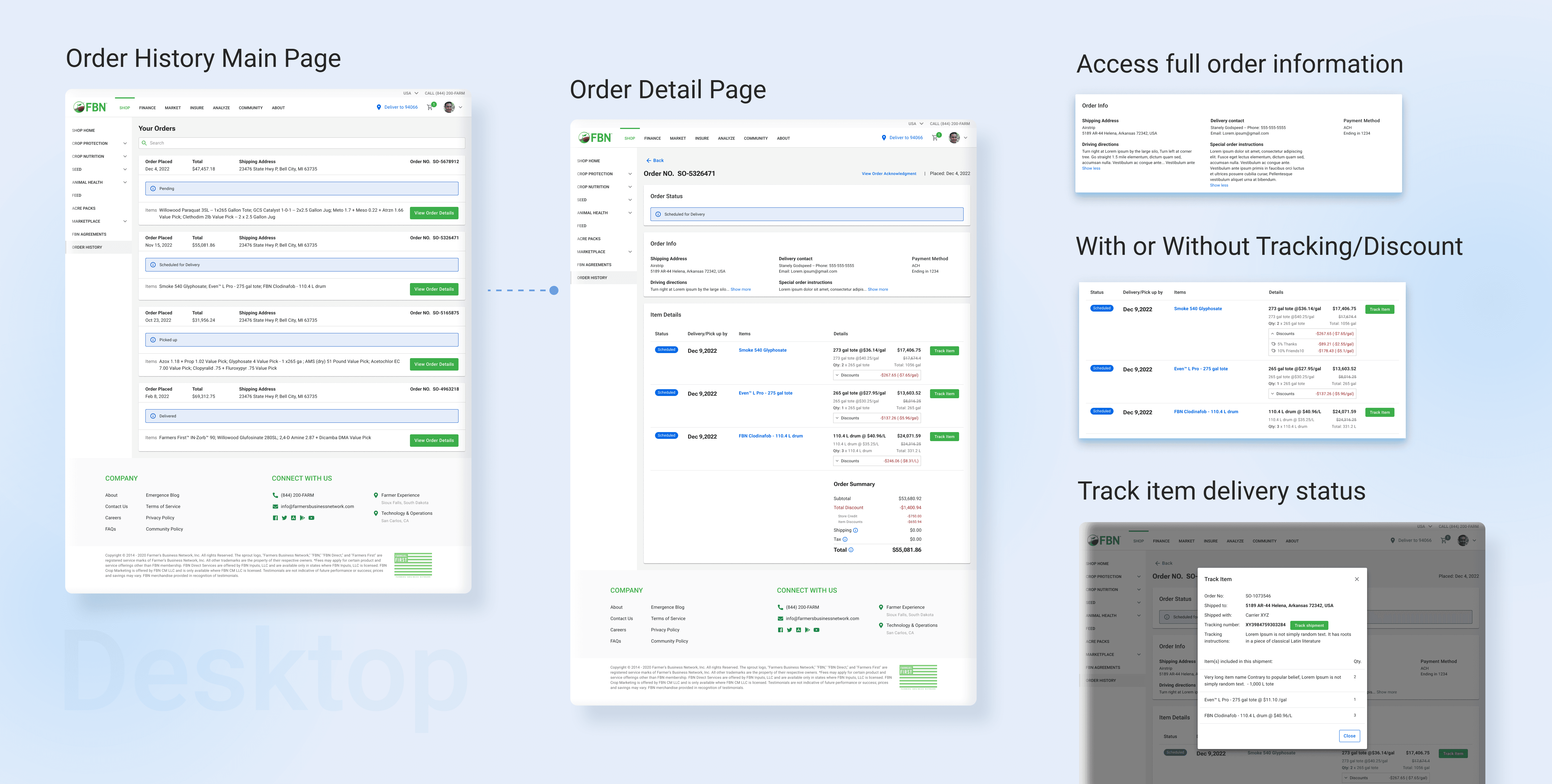
Order History
Farmers Business Network (FBN), a leading ag e-commerce retailer, recently updated its main website design, including the checkout flow. This prompted an urgent need to enhance the order history page for a cohesive user experience.
My Role
I led the redesign, overseeing the entire process from concept to implementation. This encompassed research, user interviews, mockup creation, prototype development, user testing, final product delivery, and quality assurance. Collaboration with the product manager, engineers, and stakeholders was integral to informed decision-making.
Set the Context
Following website updates and the establishment of a new design library, FBN incorporated new information into the cart and checkout flow. However, the order history page remains unchanged, resulting in a disjointed user experience. Urgency now dictates the need to redesign this page.
A complete overhaul
2 months
Key Problems
Although new information has been added to the cart and checkout flow, users are unable to view it on the order history page.
Despite updating its websites with a new design library, FBN has not yet updated the order history page, resulting in inconsistencies in design and user experience.
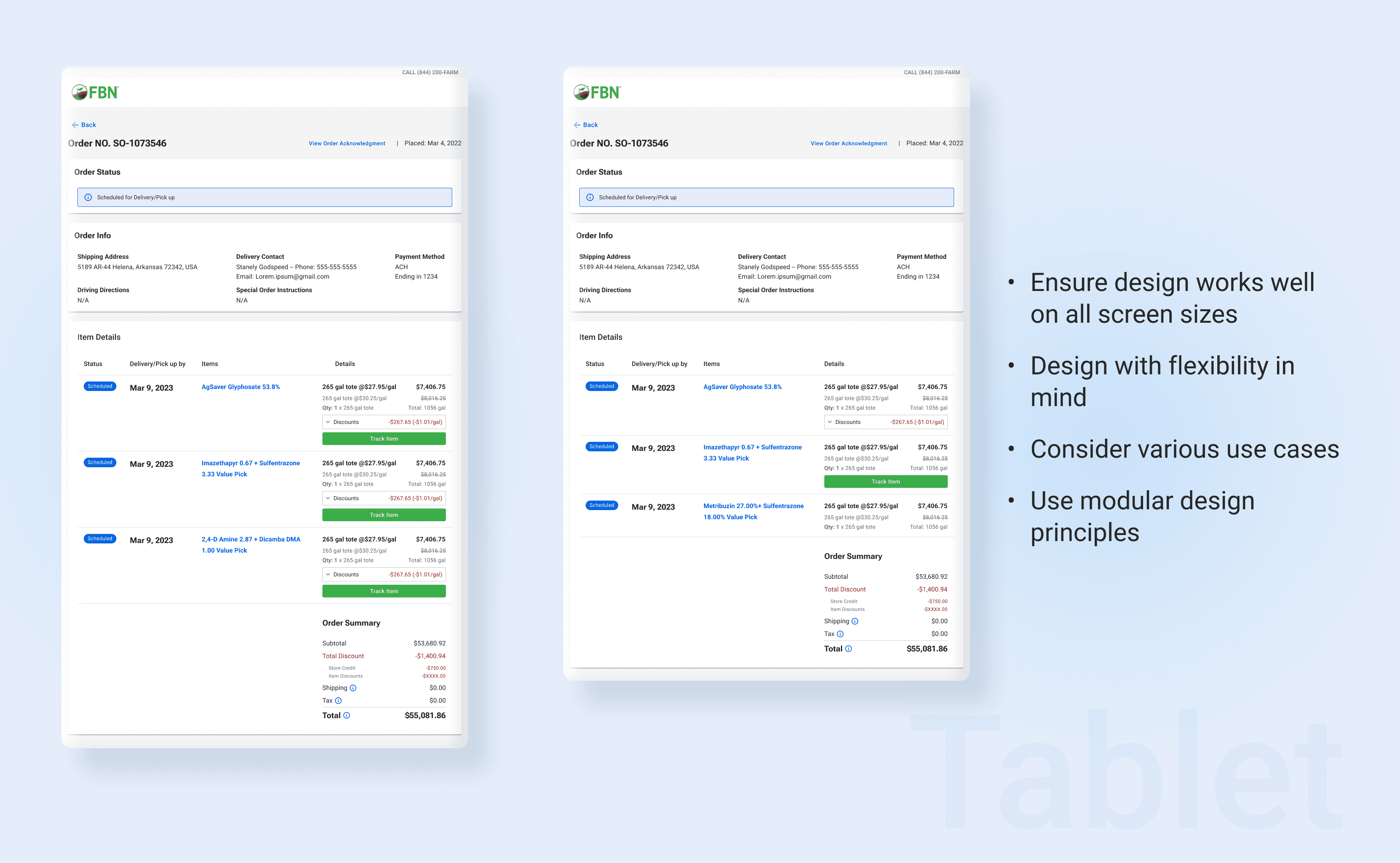
According to the data we have gathered, almost half of our website visits are made on mobile devices, but our design is not optimized for mobile use.
Target Users
Primary Users:
Existing and new farmers to FBN
Secondary Users:
Sales reps and customer experience team
Goals (HMW)
How might we provide adequate transparency and information to our users?
How might we offer a seamless and fluid shopping experience to our customers?
How might we minimize implementation efforts while improving the order history page?
The Process
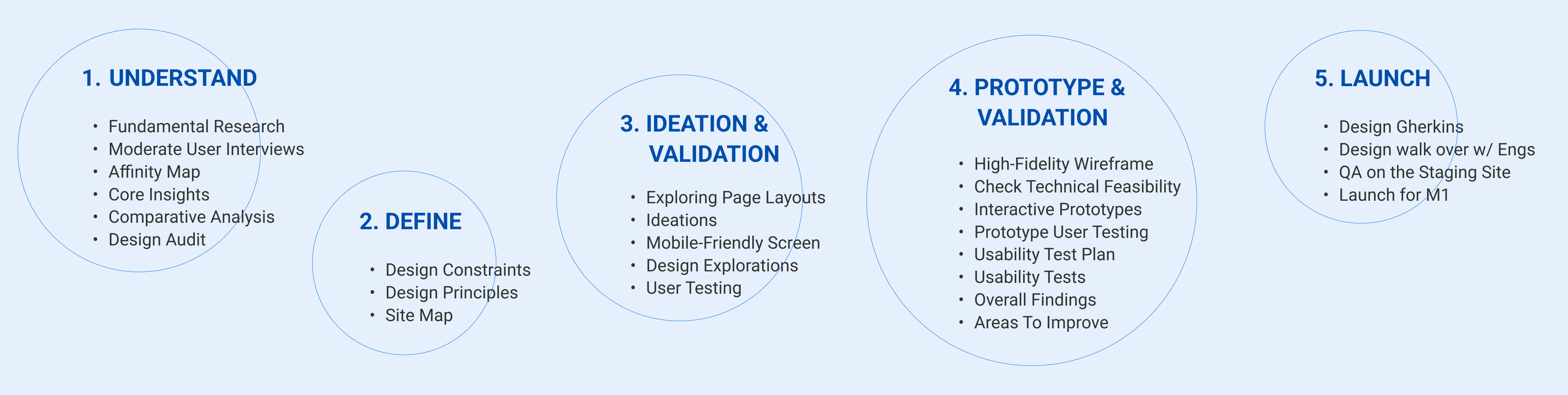
As the initial step, we conducted a two-week-long fundamental research session with a focus on redesign. Our objective was to gain a deeper understanding of the pain points experienced by users when using our current order history page and gather their expectations. We interviewed the customer experience and sales teams from various countries before recruiting users to conduct moderate user interviews, thereby gaining insights for the redesign.
I created an affinity map to extract essential points from interview notes, filter out less important details, and identify observations that could inspire the design.
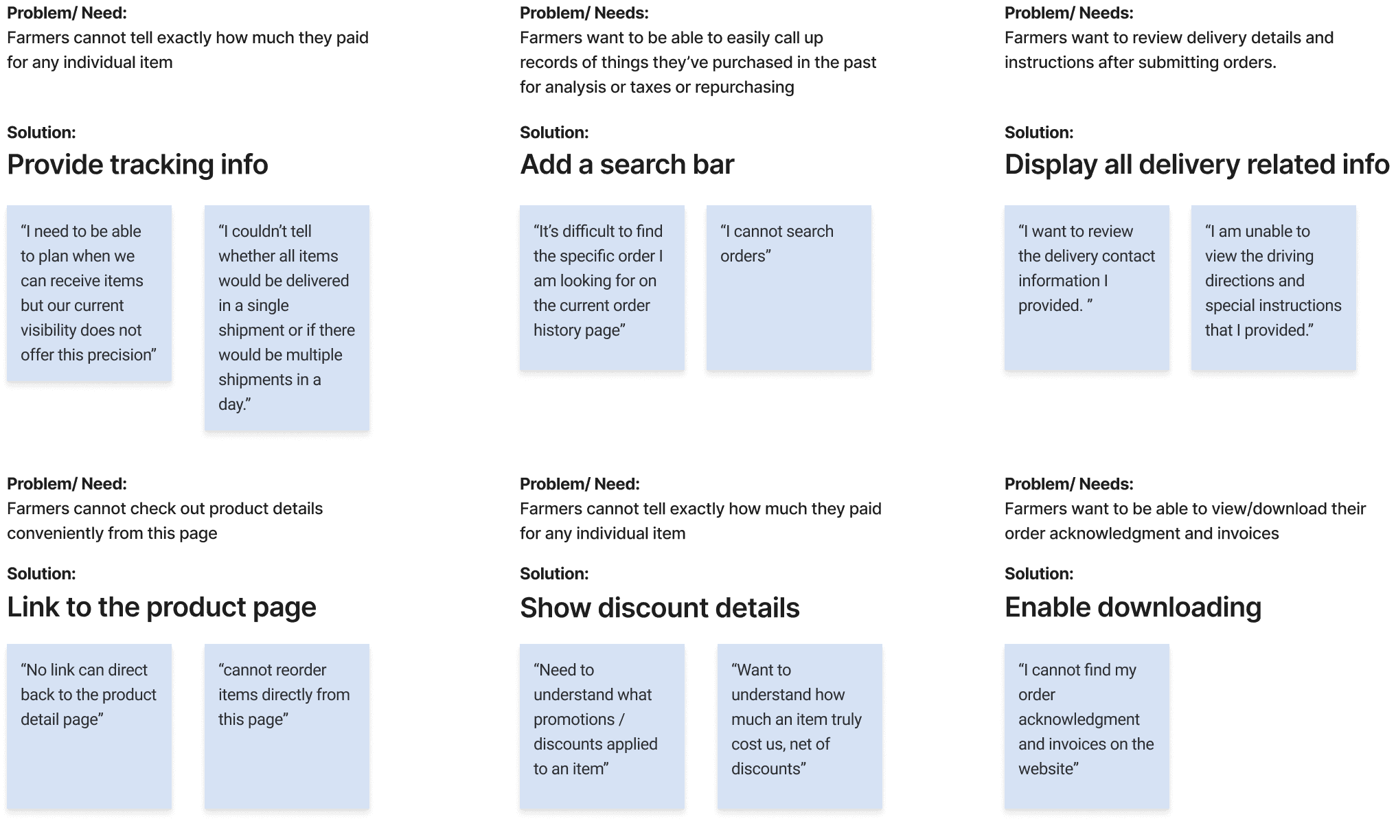
I got the following core insights:
For the next step, we conducted a comparative analysis on top e-commerce order history designs in the farming industry and related sectors. This acquainted us with leading market designs and inspired us to explore opportunities for enhancing the FBN order history page.
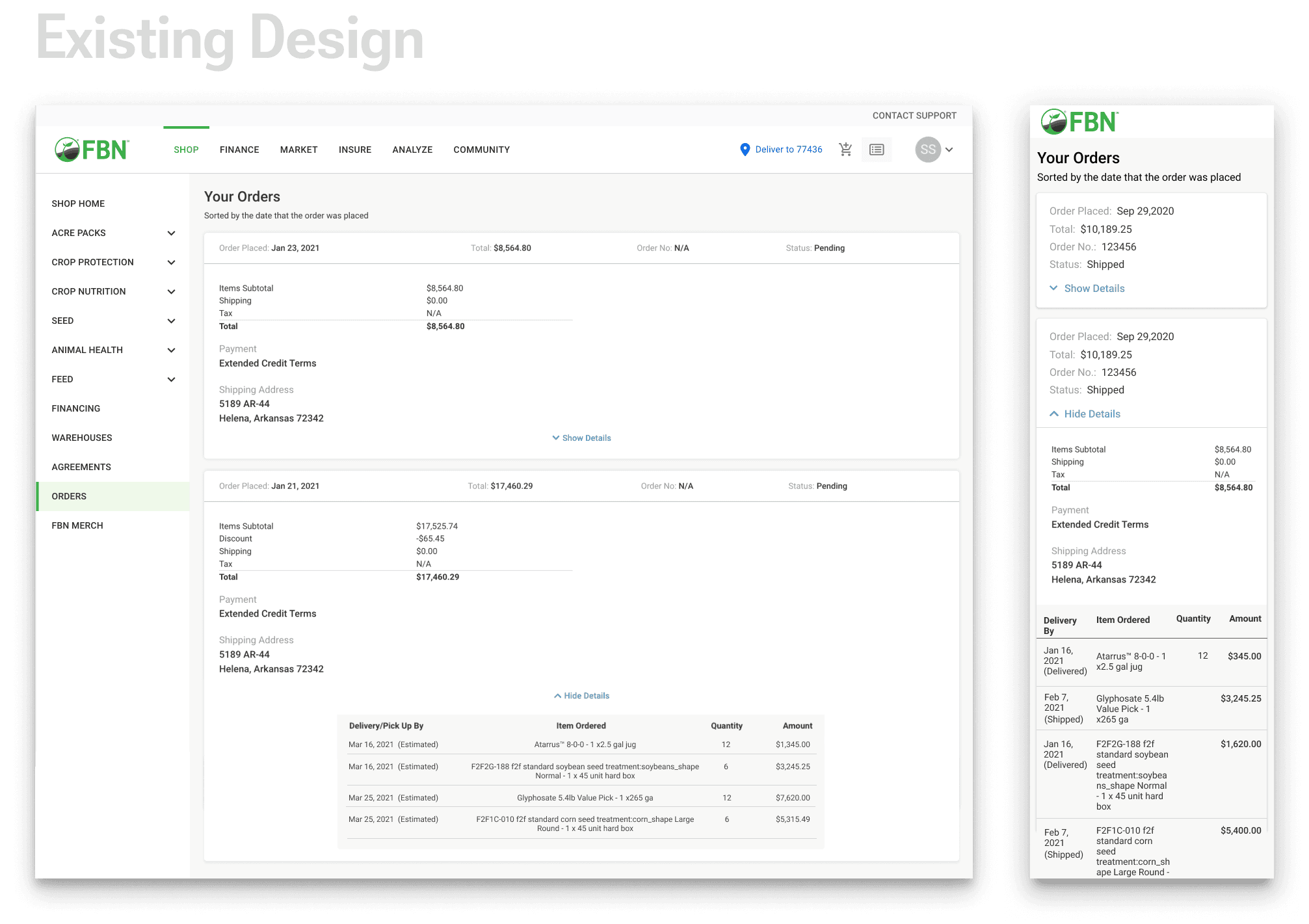
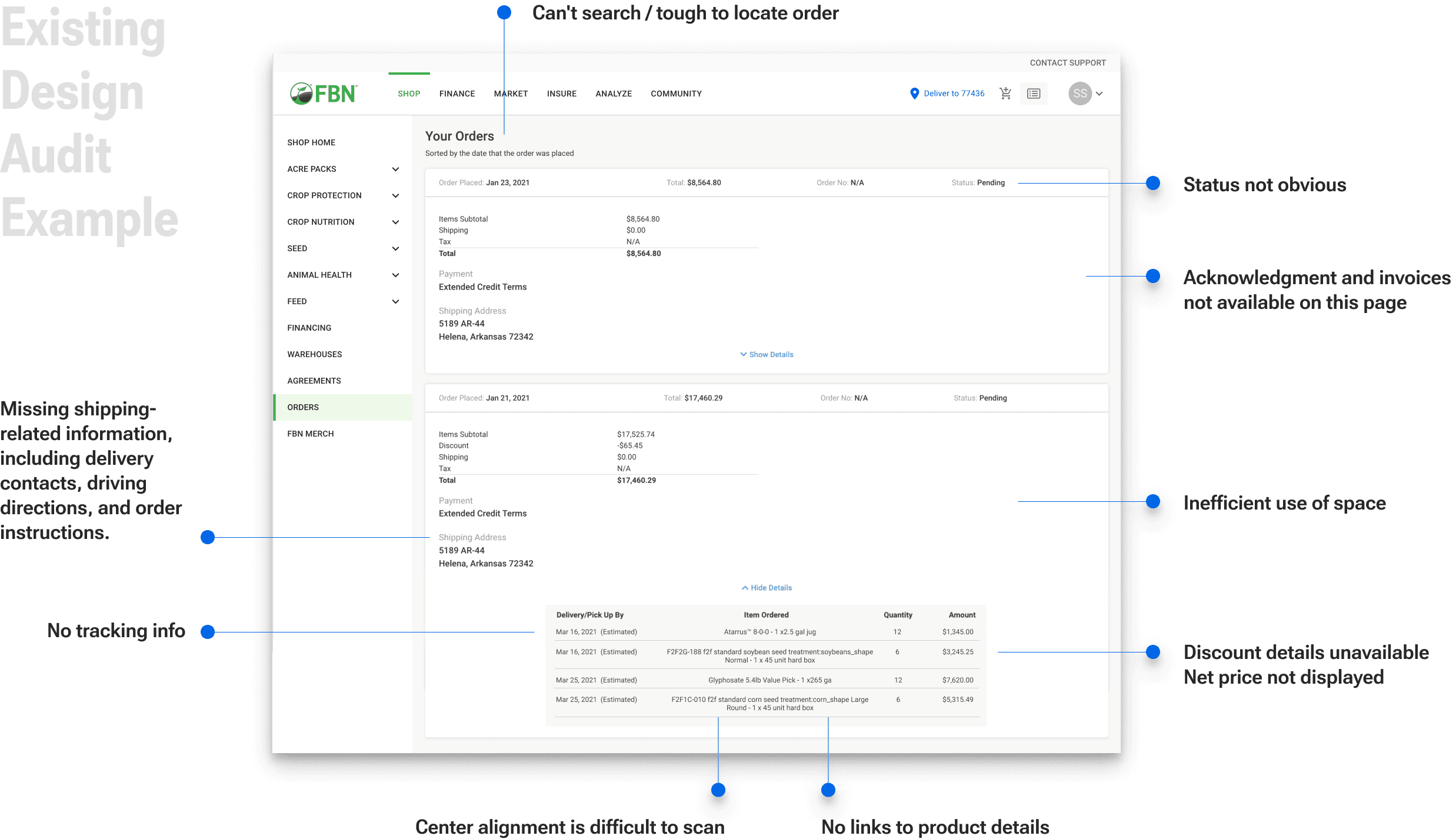
Following the comparative analysis, we conducted a design audit of our order history page across various website breakpoints. This provided a thorough understanding of our current design and identified potential improvements.
2. Define
The discovery phase helps us understand the objectives and primary pain points. Analyzing gathered data allows comparisons with existing market order history pages.
After understanding the design constraints, we established the design principles.
Design Constraints
Context of use: mobile devices take priority, followed by desktop and tablet.
Certain features cannot be included due to current limitations in available information.
Urgency demands a swift launch, so the design should aim to minimize implementation efforts.
Design Principles
Enhancing information transparency.
Ensuring consistency in user experience.
Minimizing effort required for implementation.
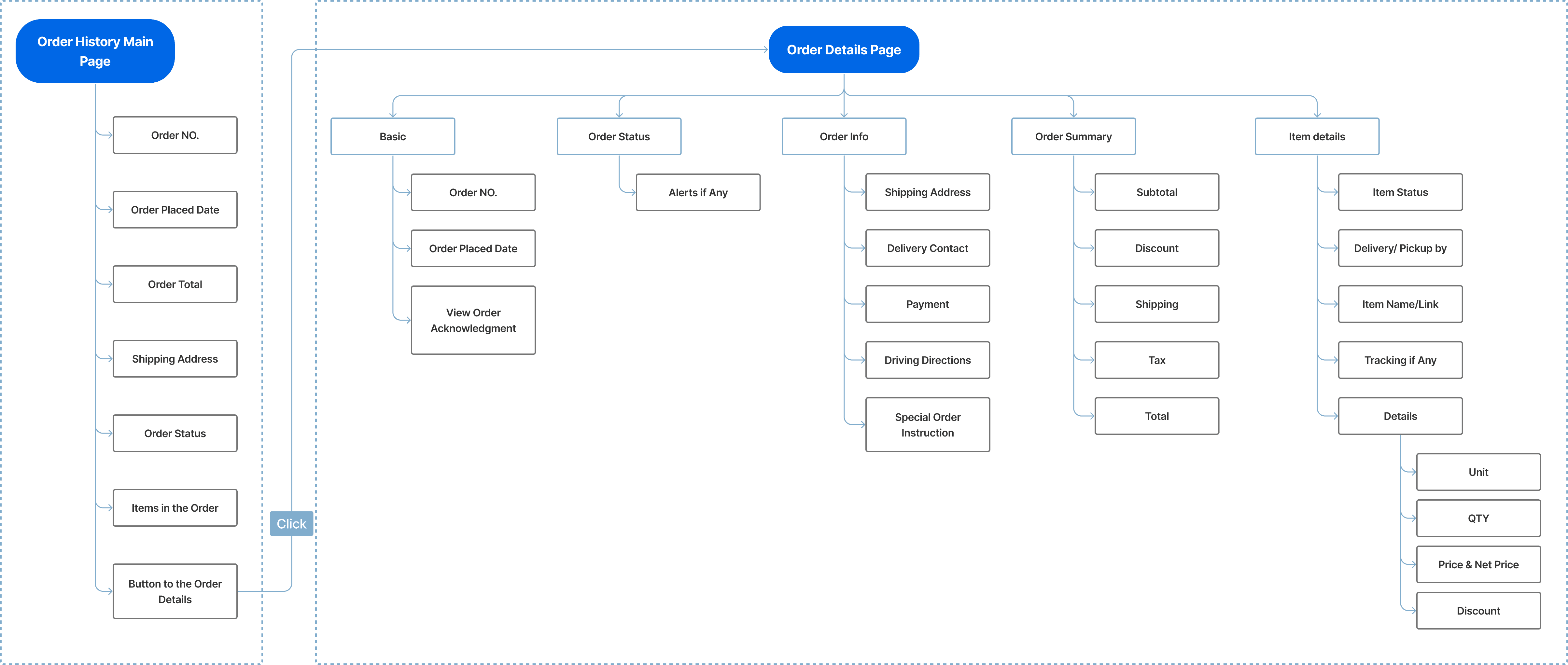
I worked with the team and developed a site map through multiple iterations to guarantee effortless navigation and structured content organization.
3 Ideation | Validation
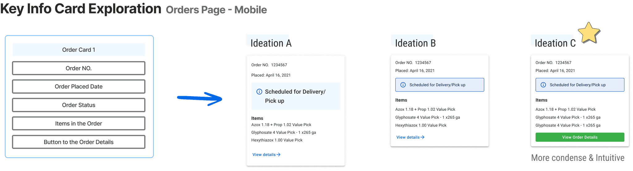
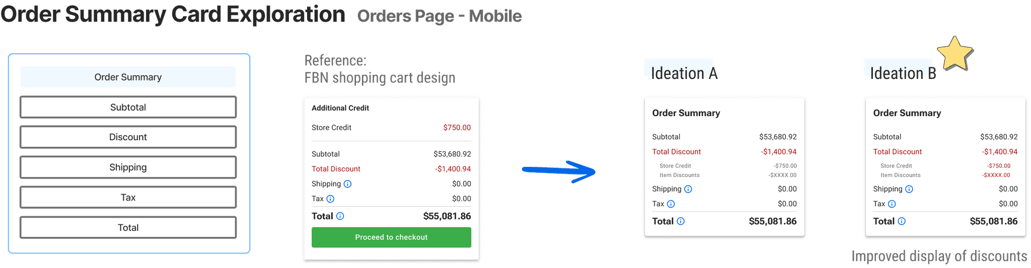
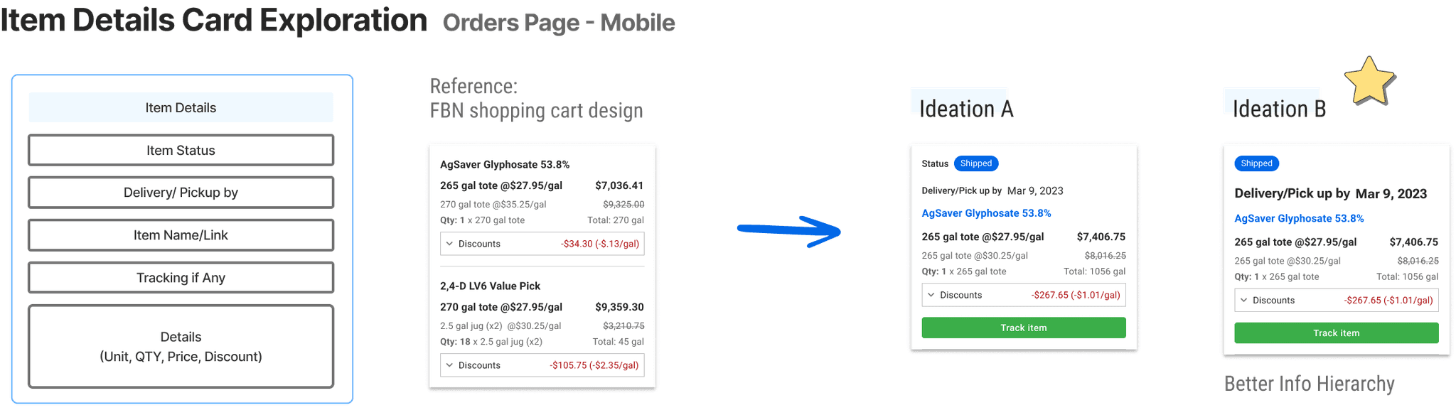
I used the site map as a guide to lay out the essential building blocks for exploring the basic information grouping and page layouts.
Next, I explored ideations, weighing pros and cons iteratively. This process helped narrow down options for optimal design. Prioritizing a mobile-friendly screen ensures convenient order history access. Referencing the latest FBN cart design ensures a consistent and fluid user experience.
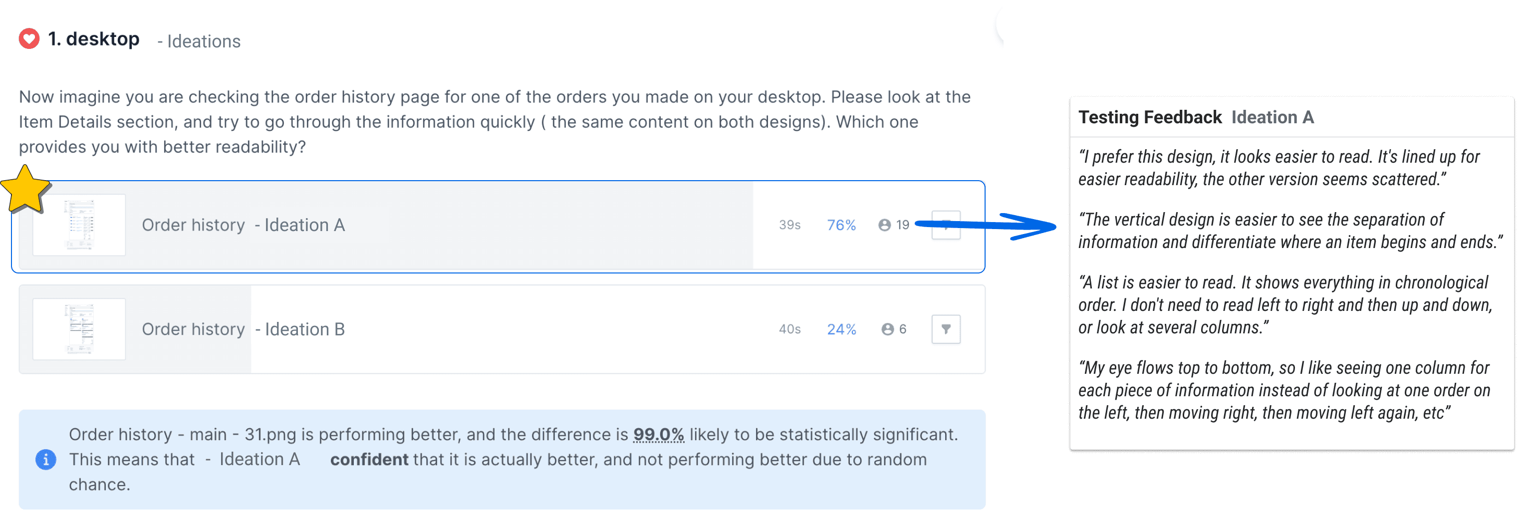
User Testing | Preference Test
For an optimized user experience, I conducted preference tests on various ideations. The goal was to identify intuitive options that offer easy access to necessary information.
Below is an example.
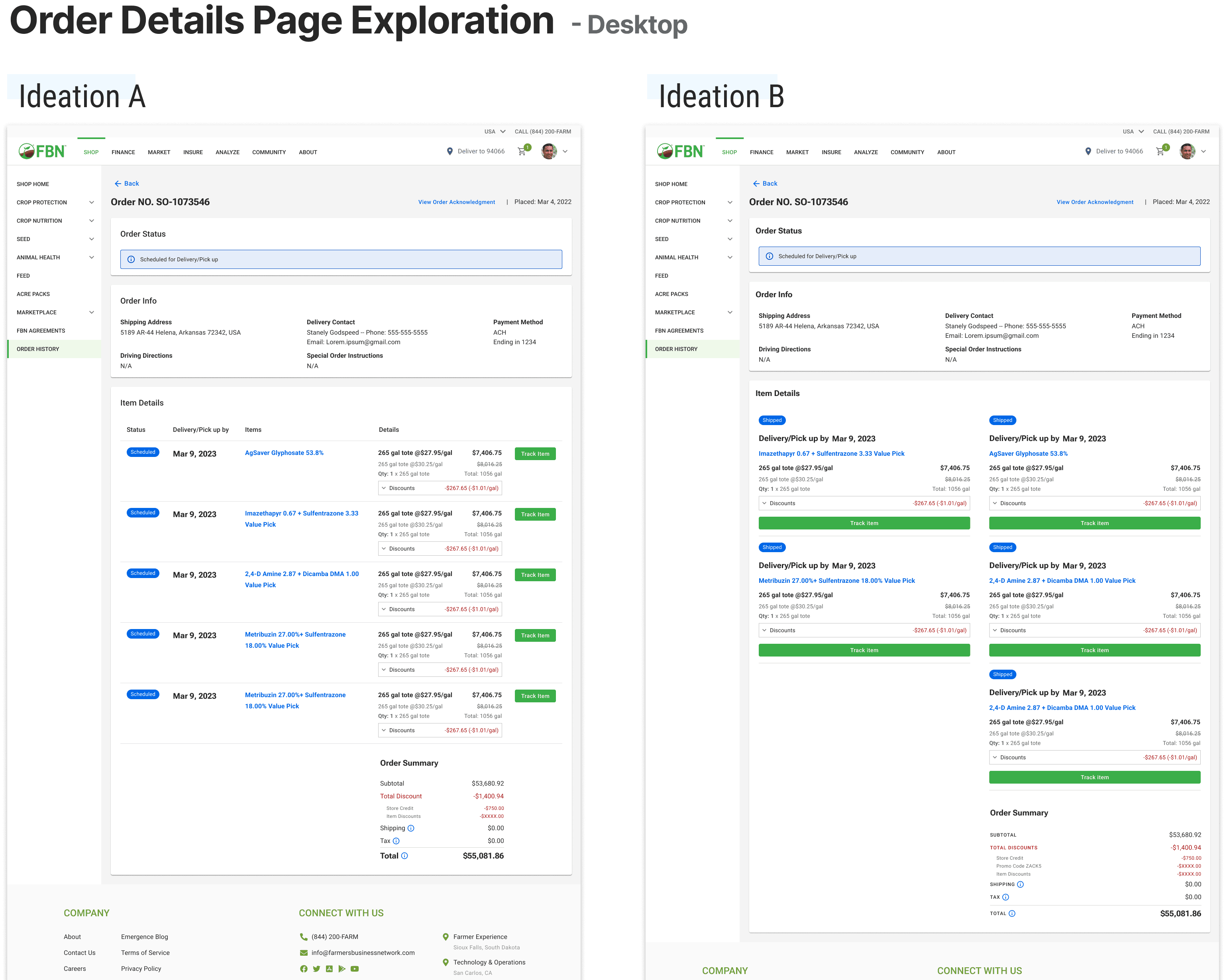
4 Prototype | Validation
The next step is to create a high-fidelity wireframe. I followed our design system library and created new components for each section. Throughout the design process, I consistently checked with engineers to ensure technical feasibility. Afterward, I developed interactive prototypes with different breakpoints for user testing.
Prototype User Testing
We developed a usability test plan and performed usability tests on the order history page across various breakpoints to ascertain whether the design and content fulfilled our users' expectations and incorporated all essential information. Furthermore, we verified that the page was user-friendly and intuitive.
Tested with 5 people for each prototype. Tool: usertesting.com
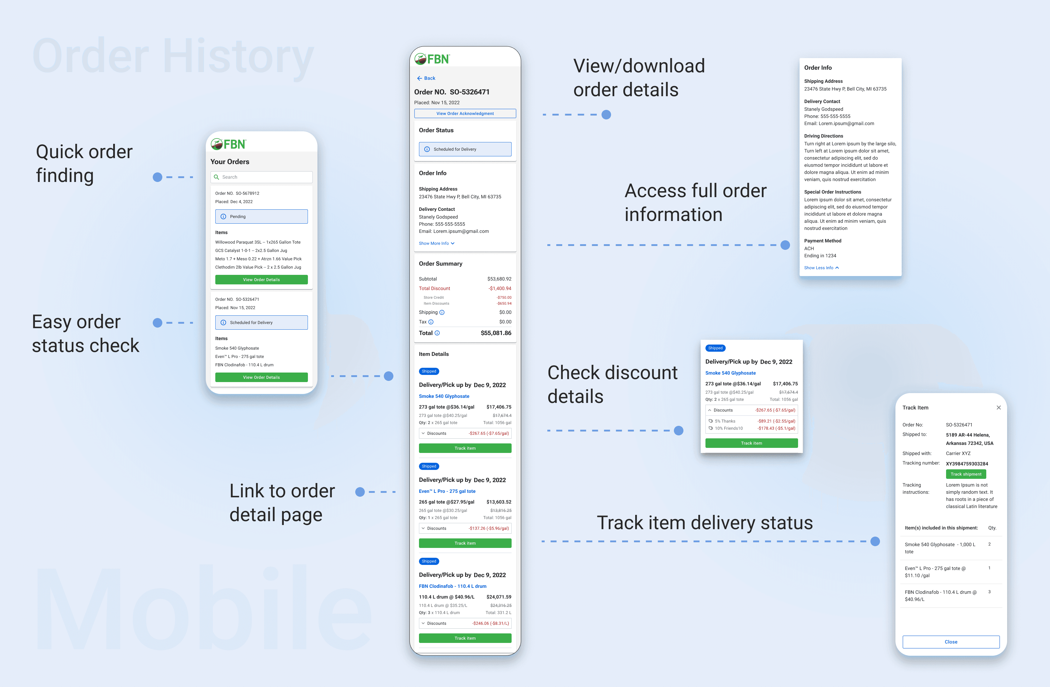
Clickable Prorotype - Mobile
Clickable Prorotype - Desktop
Overall findings:
Navigation was easy.
Users were able to quickly find all key information.
The design and content met our users' expectations.
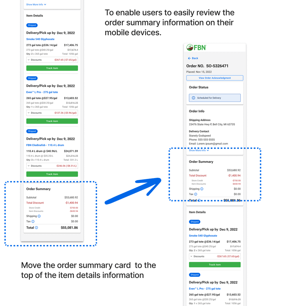
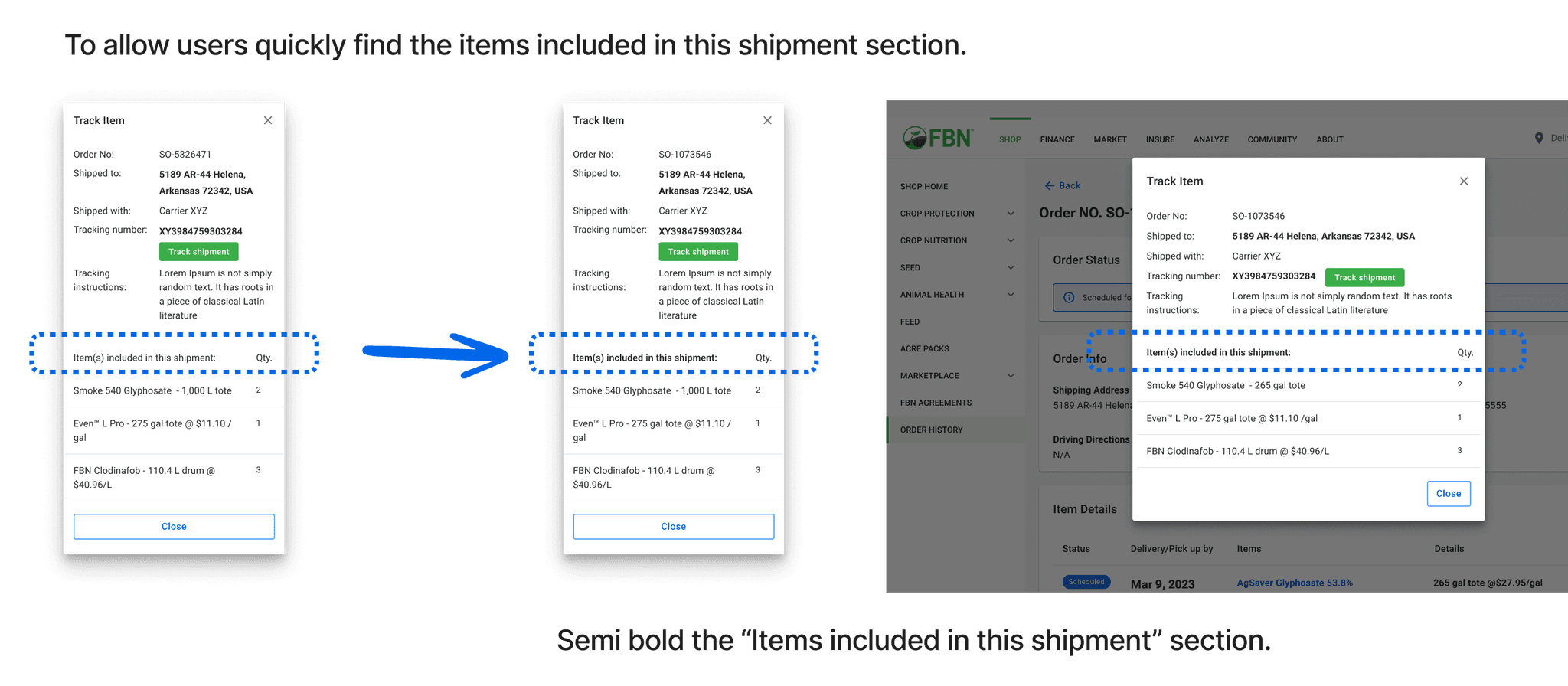
Areas to improve:
To optimize mobile usage, display the order summary before the item details information
Enhance the information hierarchy on the track item page
After analyzing the key findings from user testing, I began to revise my design.
5 Milestone One
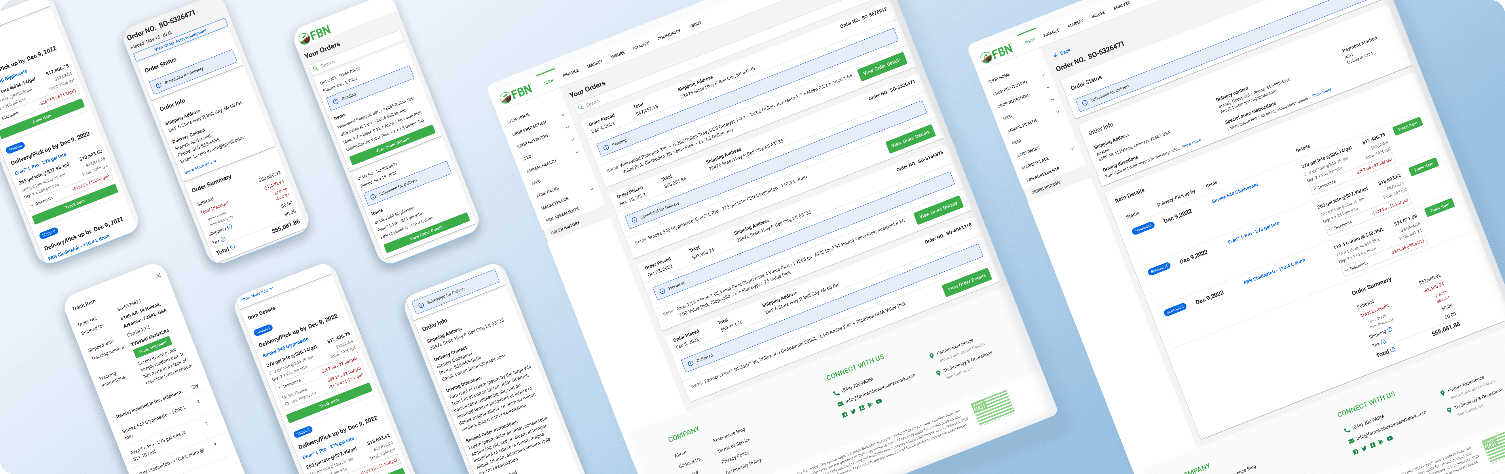
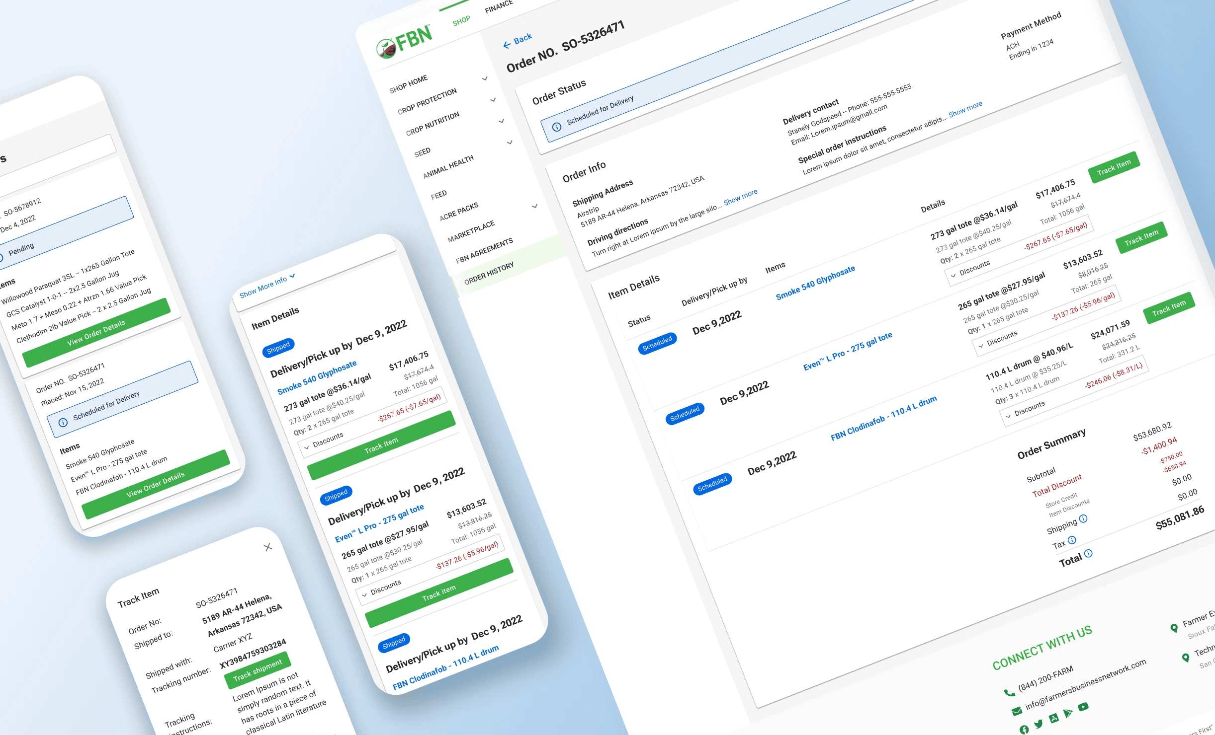
At the final stage of the design wrap-up, I created detailed design Gherkins to communicate all story-level and interaction-level information with our engineers. We held a design walkover meeting with our engineers. After they implemented the design, I conducted QA on the staging site for the final product to troubleshoot design and bug-related problems before launch. The following are Hi-Fi wireframes for key frame designs.
6. Thoughts
I took on the responsibility of managing each step throughout the entire process, from research to final launch QA, and did my best to collaborate with our PM and engineers. I am proud of the outcome and the improvements made to the minimal value of the product, but I recognize that there is still room for further growth and development in future milestones.
Next steps:
Collect real data to track the Netsuite platform's ability to support the updated discount layout.
Gather feedback from stakeholders and prepare to expand the scope for the next milestone.
Takeaway from this project:
Testing designs with users is crucial, even if there have been numerous internal design reviews, as user feedback is priceless.
By collaborating closely with different teams at an early stage, designers can improve their efficiency and effectiveness in design.