SVCA
Have you ever encountered a website that wasn't mobile-friendly or found a website too complex to navigate? These are precisely the reasons why we embarked on this project.
Here is the story of how I collaborated closely with other designers, stakeholders, and the engineering team to design a website that is optimized for mobile devices
Non-profit
16 weeks
My Role
I led the UX/UI design team throughout the project, which involved 2-4 designers at different stages. We worked closely with a project manager and a 5-person engineering group to bring the concept to life.
The Background
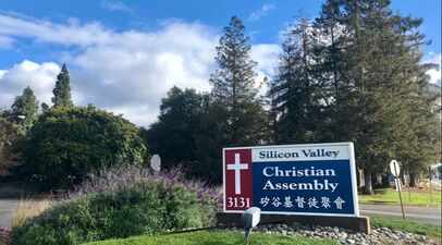
SVCA, or Silicon Valley Christian Assembly, is a church with over 25 years of history and more than 600 local members in the community, as well as thousands of followers around the world. In an effort to attract younger generations, SVCA is transitioning to a more modern approach to church engagement.
Problem Space
SVCA, a traditional church with 600 local members and global followers, has a non-mobile-friendly Chinese website with outdated content for over a decade. To appeal to younger generations, SVCA plans to prioritize a mobile website, eventually replacing the outdated desktop version.
The Challenge
Essential features only:
Creating a streamlined mobile site is crucial to counter the confusion caused by the current desktop website's complex features, which often frustrate users.
Keep branding consistent:
Designing a website that mirrors SVCA's established branding is crucial. It should capture both the digital and physical essence of the church.
Technique constraints:
As a part-time project with limited resources, coding complex features is not feasible. Thus, we must use available resources to develop a mobile site that fulfills users' essential needs.
Goals (HMW)
How might we use the SVCA website as a channel to attract more people to visit?
How might we provide features that meet the primary needs of the majority of local members?
How might we improve the user experience for oversea users?
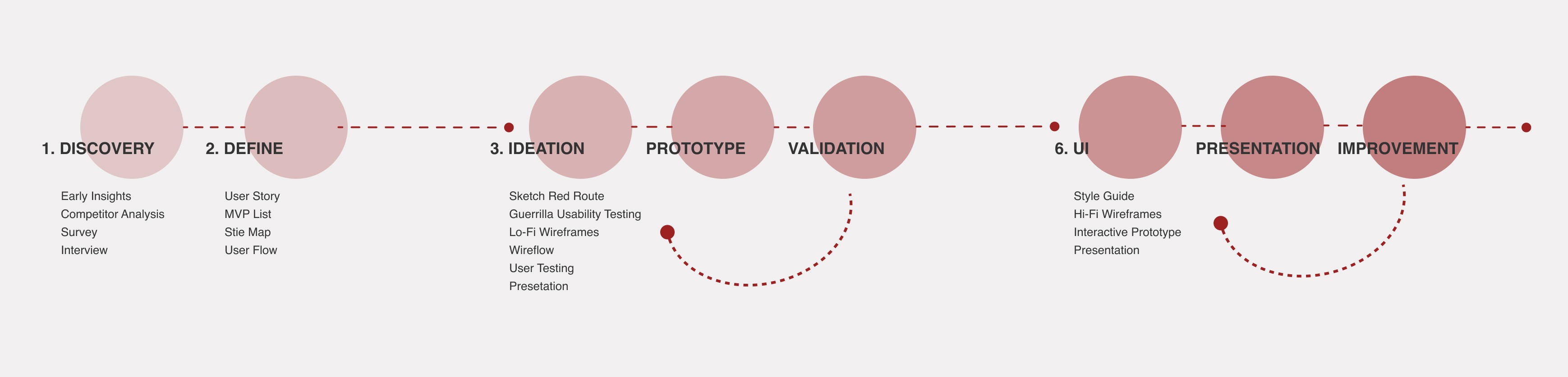
The Process
I kept design thinking in mind throughout the project and used a lean UX cycle, involving users and developers early on to empower everyone to design. We also used agile UX to iterate our design and avoid handing over big upfront designs to our development team.
In the initial phase, we collected early insights by randomly asking people about their impressions of the current SVCA desktop website design. This aimed to understand users' expectations and guide the design of the new mobile site. Here's what we found

To streamline features and content, my next move was diving into a competitor analysis, exploring three popular church websites for contemporary mobile design insights.
To set the project stage, we convened a kick-off meeting with a diverse team, engaging stakeholders, designers, and engineers.
With the project's vision in mind, I employed screener surveys and user interviews, delving into users' experiences with the SVCA desktop site, uncovering likes, dislikes, and pain points.
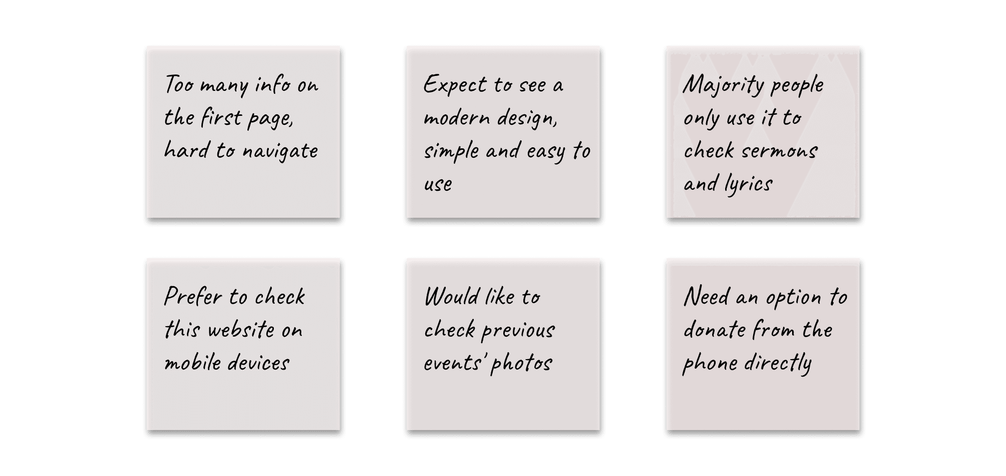
Transforming interview notes into actionable insights, I crafted an affinity map, distilling key points that fueled the design inspiration. Here are the keynotes:
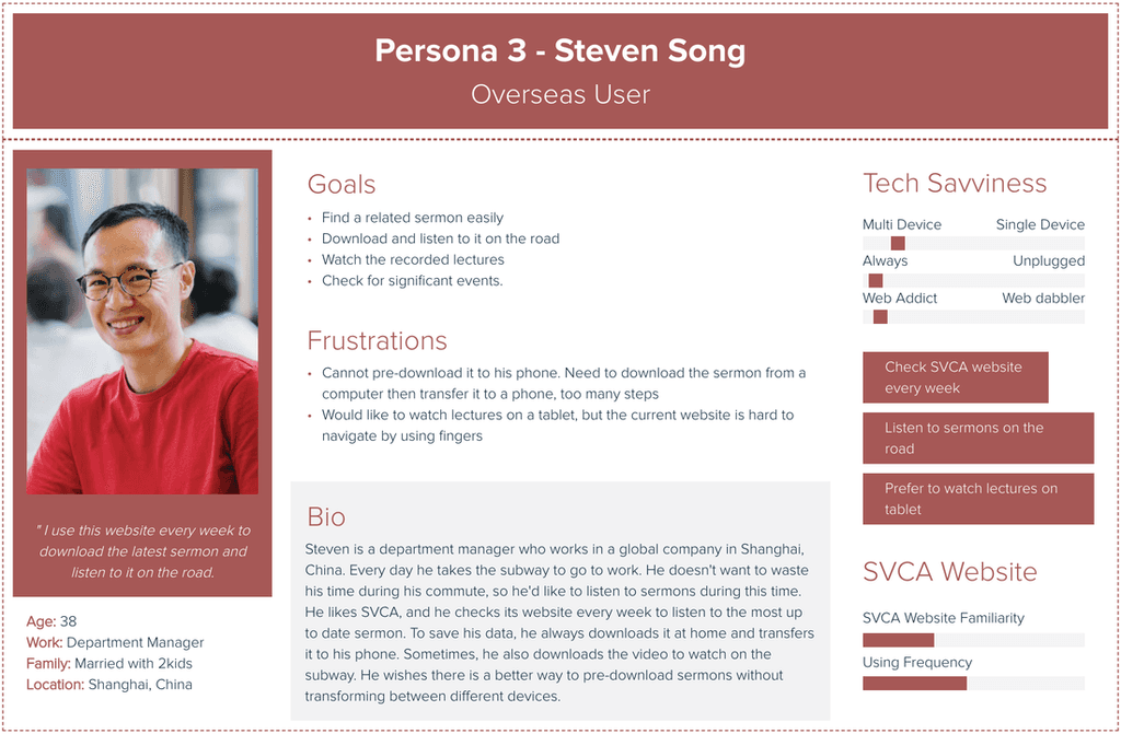
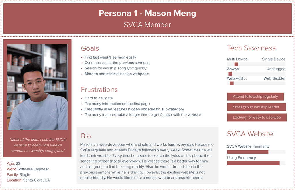
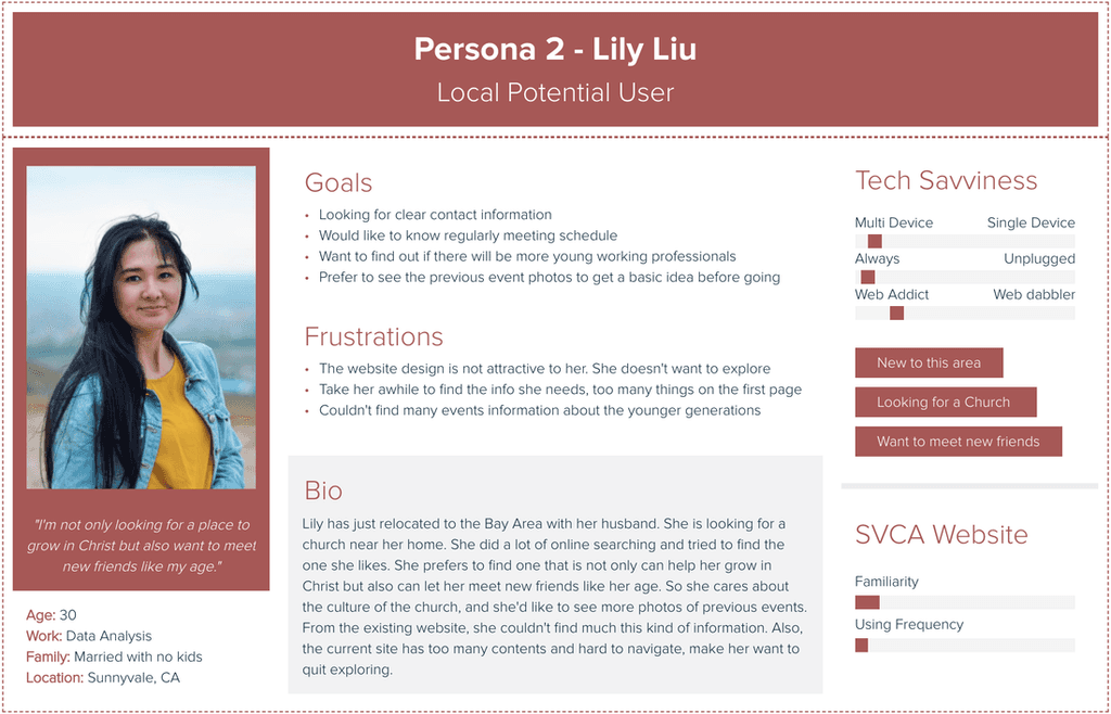
Based on the unique needs of each user group identified through interviews and surveys, I created three personas.
2. Define
The discovery phase helped us to better understand the goals and major pain points of users, and allowed us to create user stories and develop a list of MVP features.
We refined our design direction and organized portfolio content using insights from the discovery phase. Creating a site map for intuitive navigation, we gained a clearer overview, pinpointed key interactions, and established primary user flows.
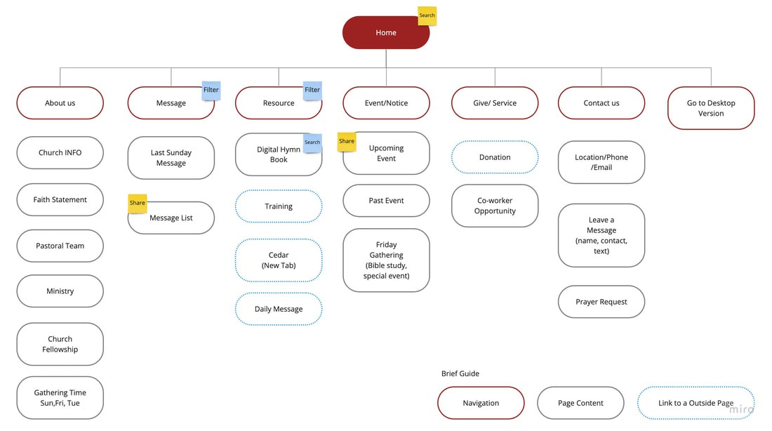
Considering the results, we analyzed essential navigation tasks and crafted user flows to grasp how users can accomplish these tasks on the website. Our goal was to minimize distractions, enabling users to concentrate on their intended tasks seamlessly.
3. Ideation | Prototype | Validation
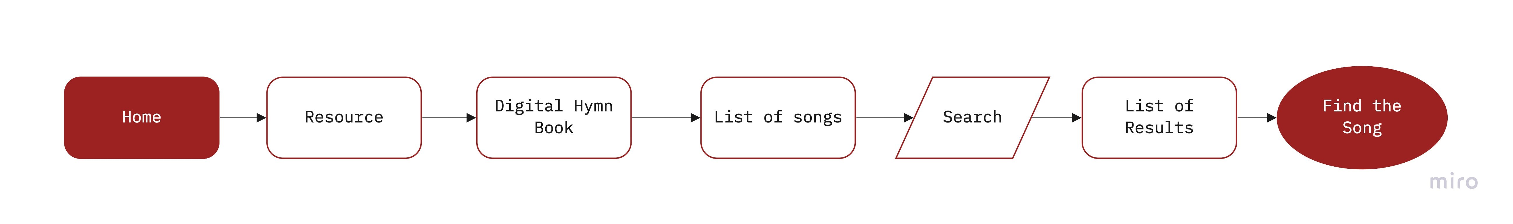
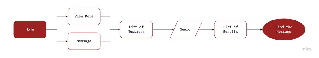
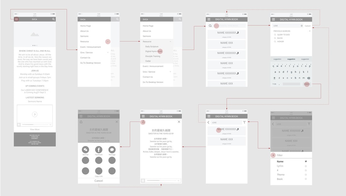
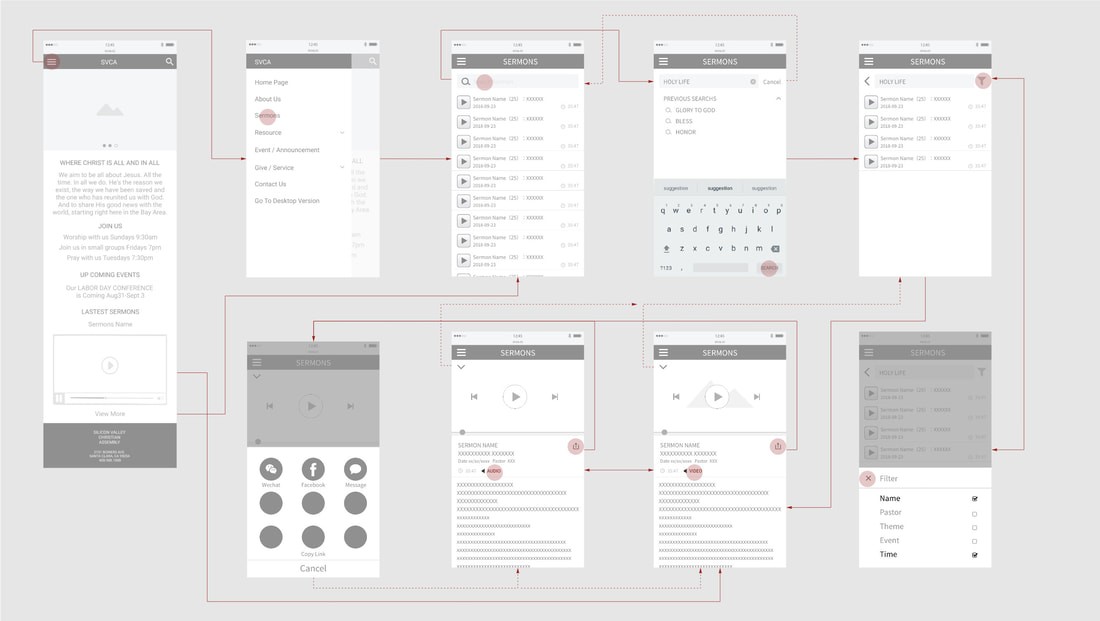
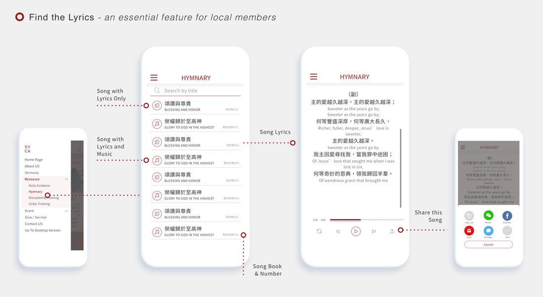
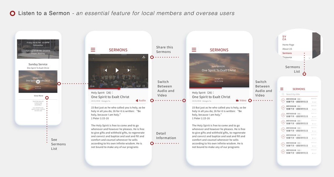
In this step, we assigned two user tasks to each designer, and my focus was on the critical tasks 'Find a Lyric' and 'Find a Sermon.' Employing the red routes method, I quickly sketched user flows to explore design options through rapid iteration.
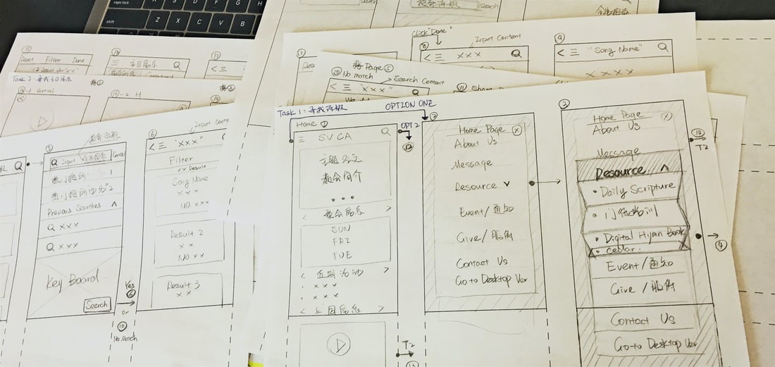
Lo-Fi User Testing Round 1
Then, I created initial low-fidelity wireframes for key screens, incorporating feedback. We then conducted guerrilla usability testing for swift and cost-effective insights into user intuition and areas for design improvement.
We received mostly positive feedback on the smoother design process.
Key Findings:
Simplify the sermon page by having only one list instead of two.
Offer both audio and video options for users who listen to sermons.
Change the list style to show more messages on one page.
Tested with 5 people, each person about 30-45 mins.
Following that, I integrated feedback and developed a wireframe flow to document all potential interactions and user flows within the design.
Lo-Fi User Testing Round 2
After completing the wireframes, I conducted user testing to assess whether users were able to complete the assigned tasks. Here are the key findings:
Overall:
Users praised the design for its simplicity and meeting their needs.
Navigation and icon designs were lauded for their simplicity.
No major usability issues were identified during user testing.
Key Findings:
Sermon page: The default playback option should be audio instead of video.
Tested with 5 people, each person about 30-45 mins.
We also presented our designs to the engineering team to receive their feedback on the technical aspects.
Feedback from the engineering team
"Advanced searching" and "Global play" are great features, but they require significant time and effort for our engineers to implement. Unfortunately, these advanced designs won't fit into our current timeline.
I put myself in the users' shoes and had a thorough discussion with them. We decided to proceed with the necessary "search" and "in-page play" designs since these functions can meet users' fundamental needs and fit into our current timeline. We can leave more advanced features for future releases.
4. UI | Presentation | Improvement
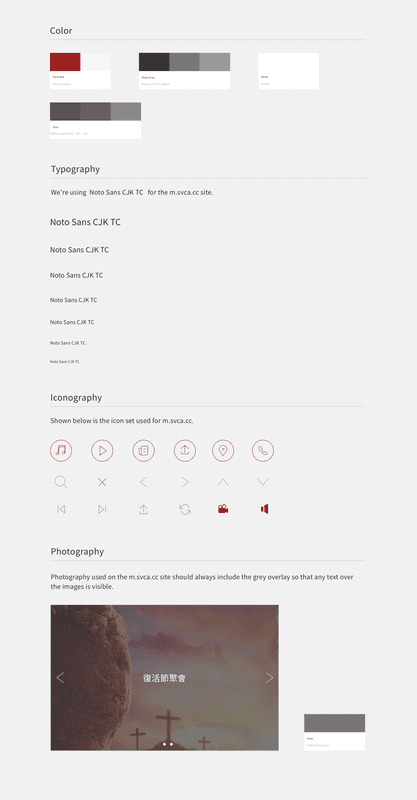
After refining my wireframes, I developed the style guide. Choosing a dark red as the primary color to maintain continuity with the original desktop version, I focused on a minimal and clean design for screens with abundant information to ensure a smooth user experience.
Hi-Fi User Testing
Applying the style guide to the design, I crafted a clickable prototype and conducted a round of moderated usability testing.
Key Findings:
Differentiate lyrics in two languages with distinct colors and font sizes.
Emphasize the selected page on the sidebar for easy recall by users.
Tested with 5 people, each person about 30-45 mins. Tool: Invision
Engage with stakeholders and the Engineering Team
We presented to stakeholders and the engineering team, receiving positive feedback confirming alignment with SVCA's vision. I also prepared a redline document for the engineering team.
5 Launch for Milestone One
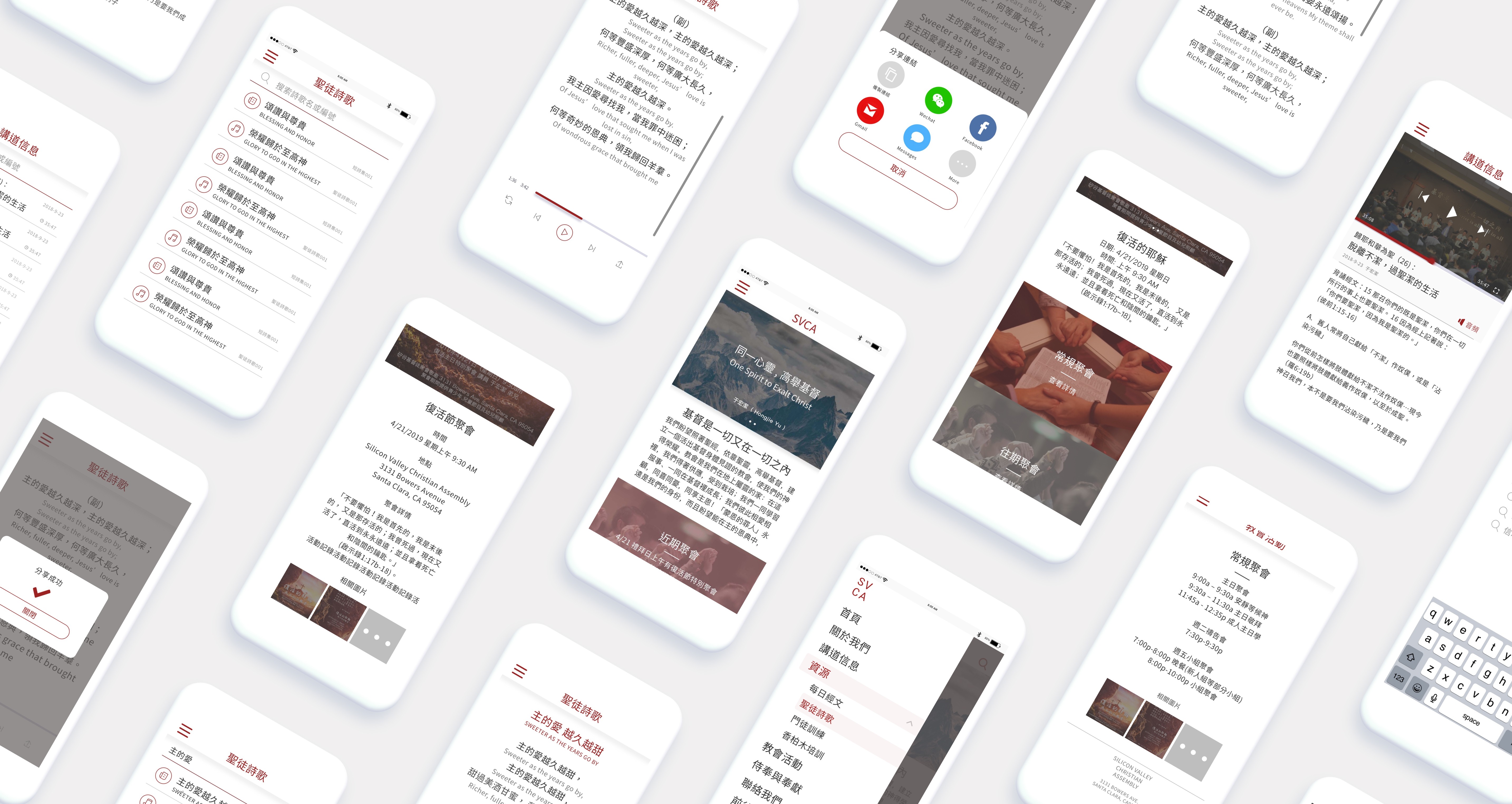
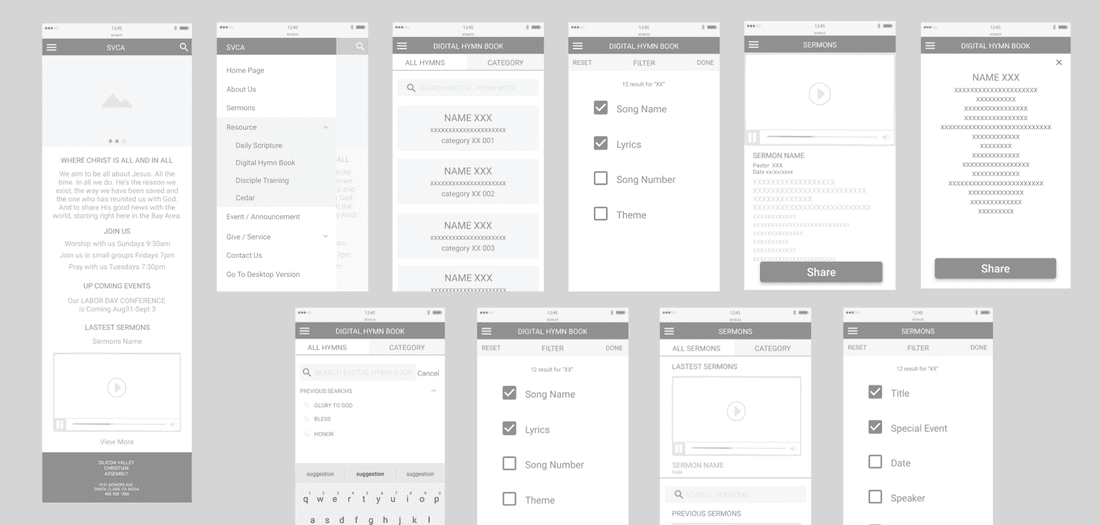
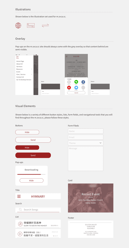
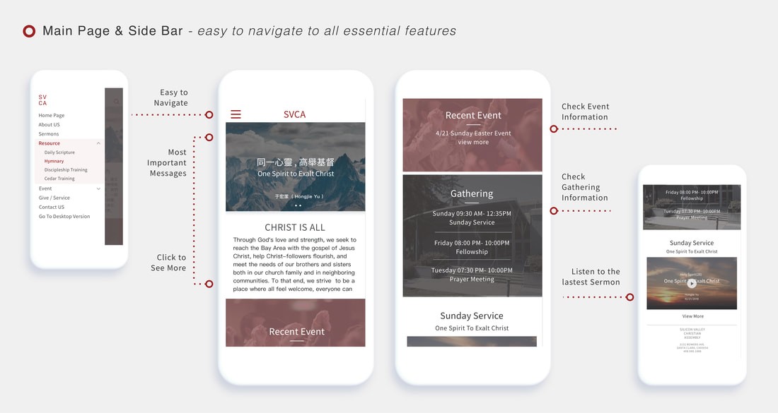
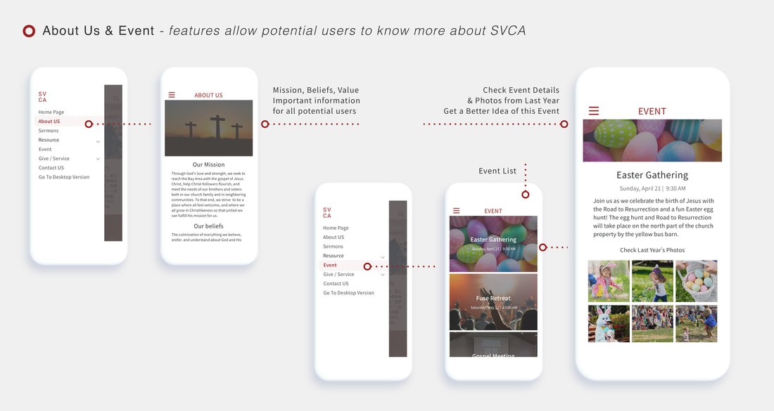
Below are HI-FI wireframes for key frame designs.
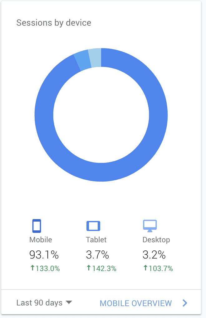
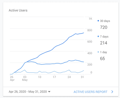
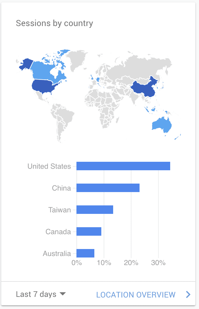
6. Impact
Google Analytics
7. Thoughts
Even though this is an ongoing project, I have learned a lot so far, and I would like to share:
Providing more design details during testing can result in more valuable feedback.
It's important to pay attention not only to what users say but also to what they don't say.
Involving stakeholders in all key phases helps ensure that the design aligns with the business's big vision.
Working closely with the engineering team is crucial.