
Ever experienced the frustration of running out of ideas for where to eat? Feel overwhelmed when deciding on a restaurant? Struggle to choose when you're unsure of your food cravings?
The following is the story of how Foodea is enhancing users' restaurant-finding experience.
My Role
My role involved a variety of design tasks, including research, user flows, information architecture, sketching, wireframing, UI design, prototyping, testing, and more. As the sole designer, I was responsible for completing all of these tasks and ensuring that the final product met the needs and expectations of the users.
Problem Space
Finding a place to eat is often a challenging and frustrating experience. Many struggle to identify food that suits their taste, lack information for informed decisions, and hesitate to spend time researching. The prospect of blindly trying a new restaurant can be daunting and unappealing.
Hypothesis (HMW)
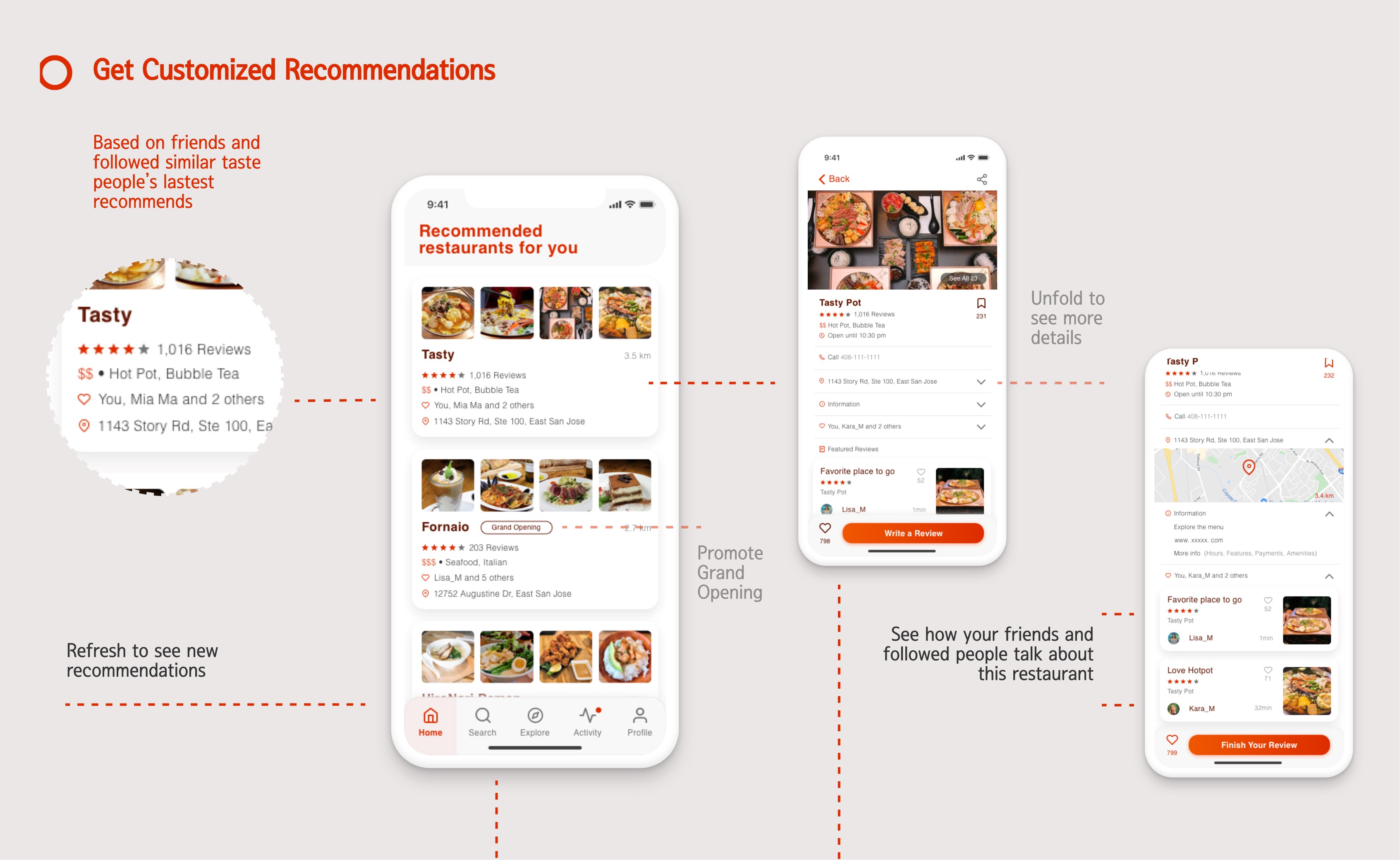
Provide personalized restaurant recommendations based on users' taste preferences.
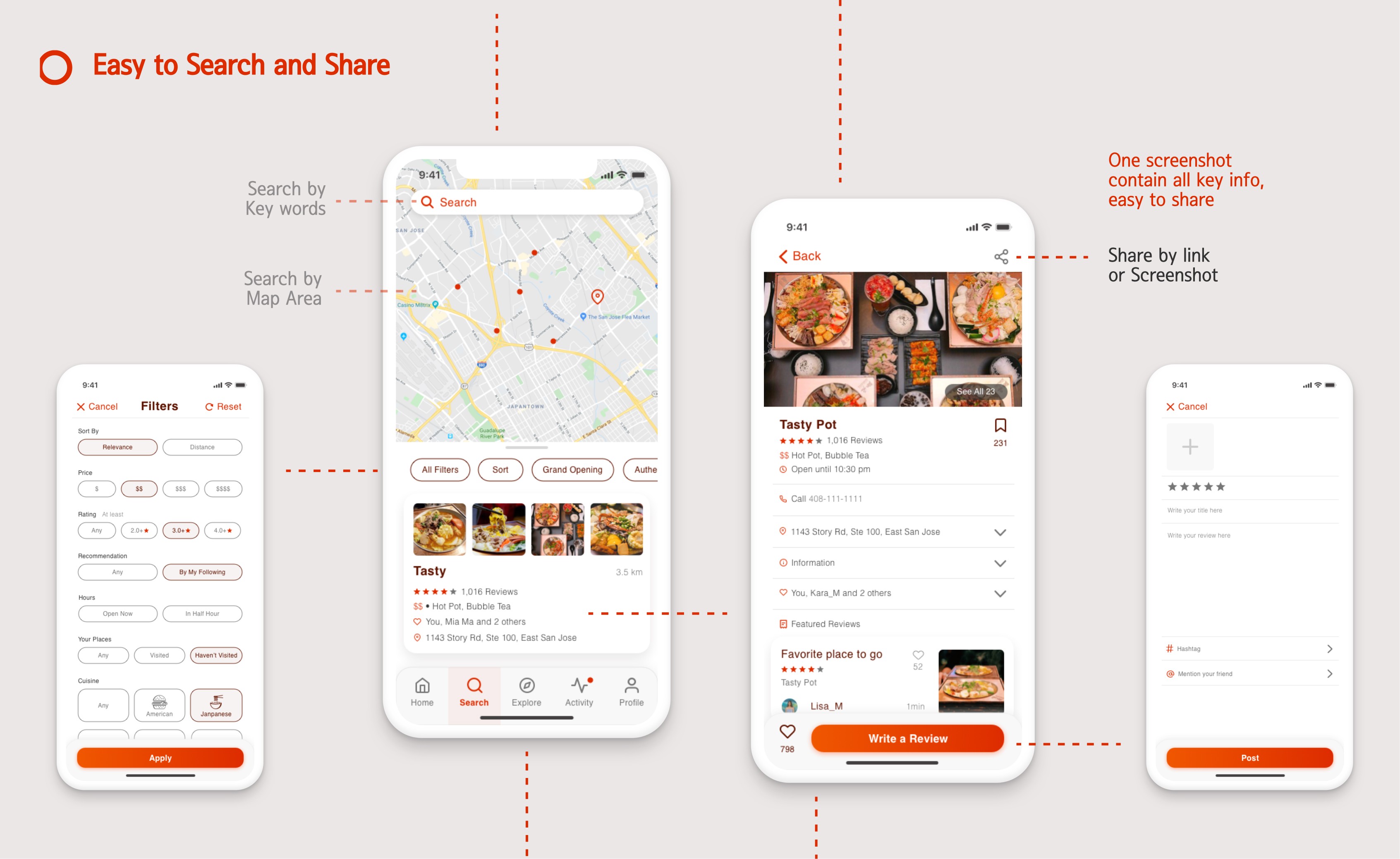
Display relevant reviews from other users to assist in decision-making.
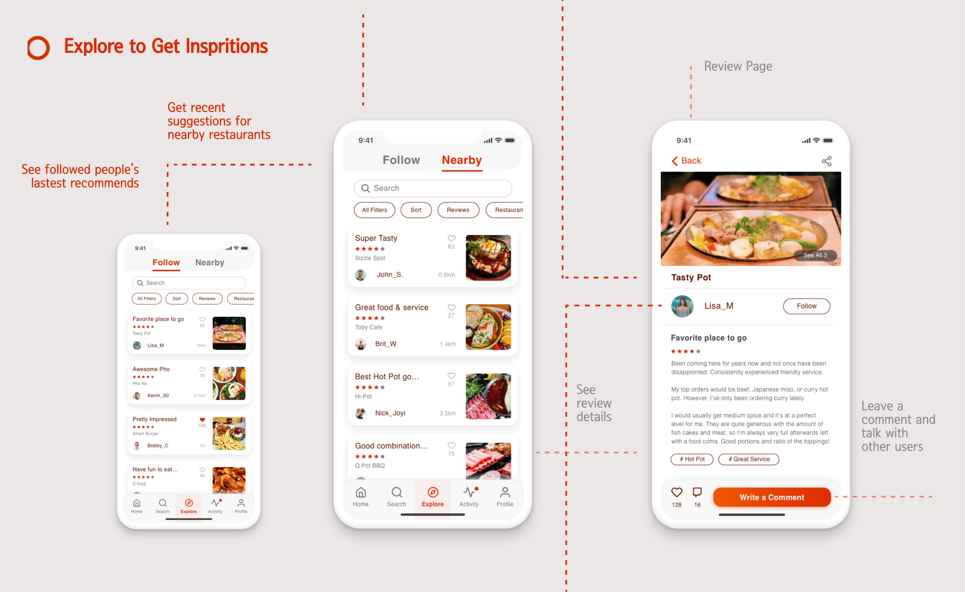
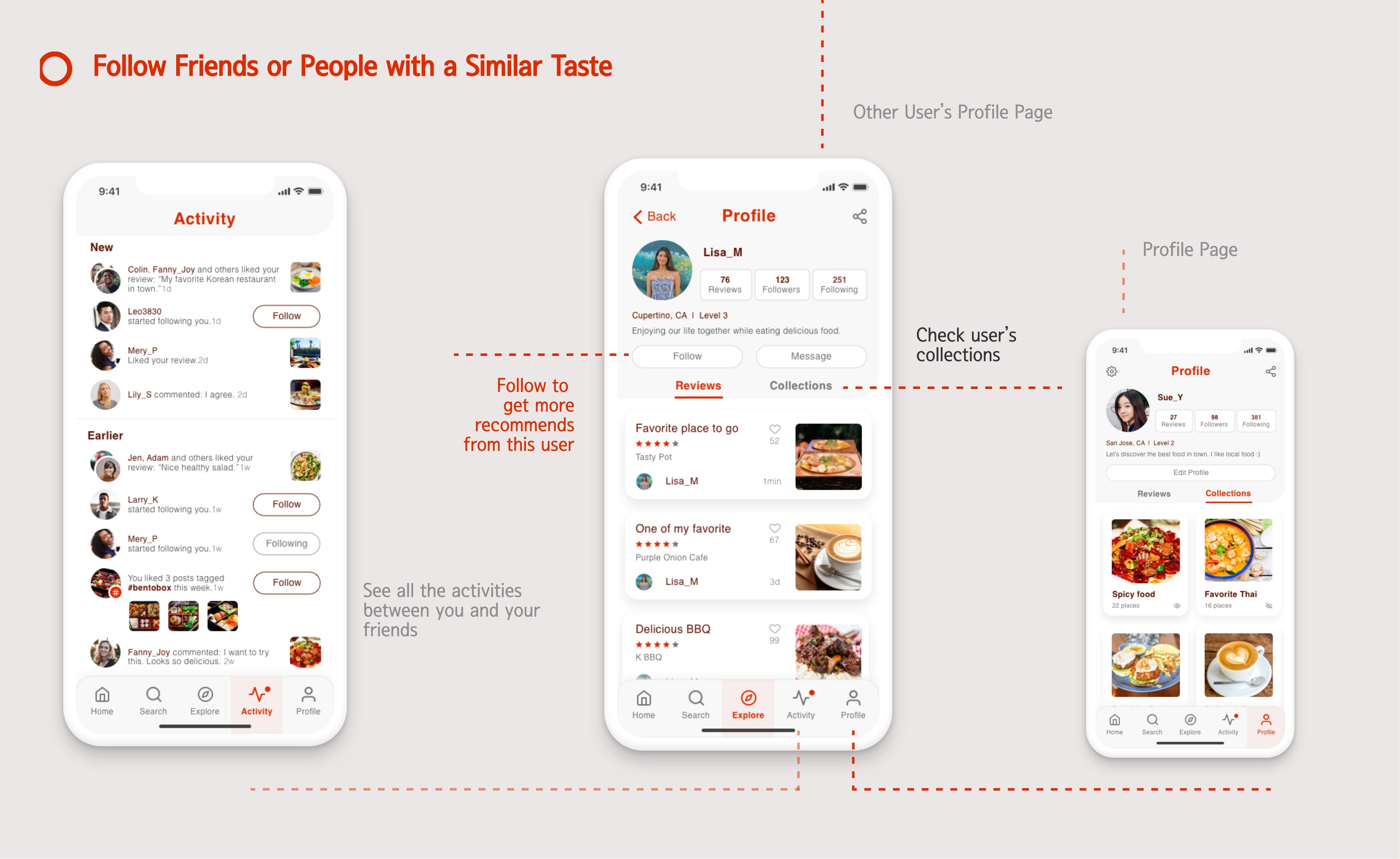
Offer eating inspiration by showcasing recommendations from other users.
The Process
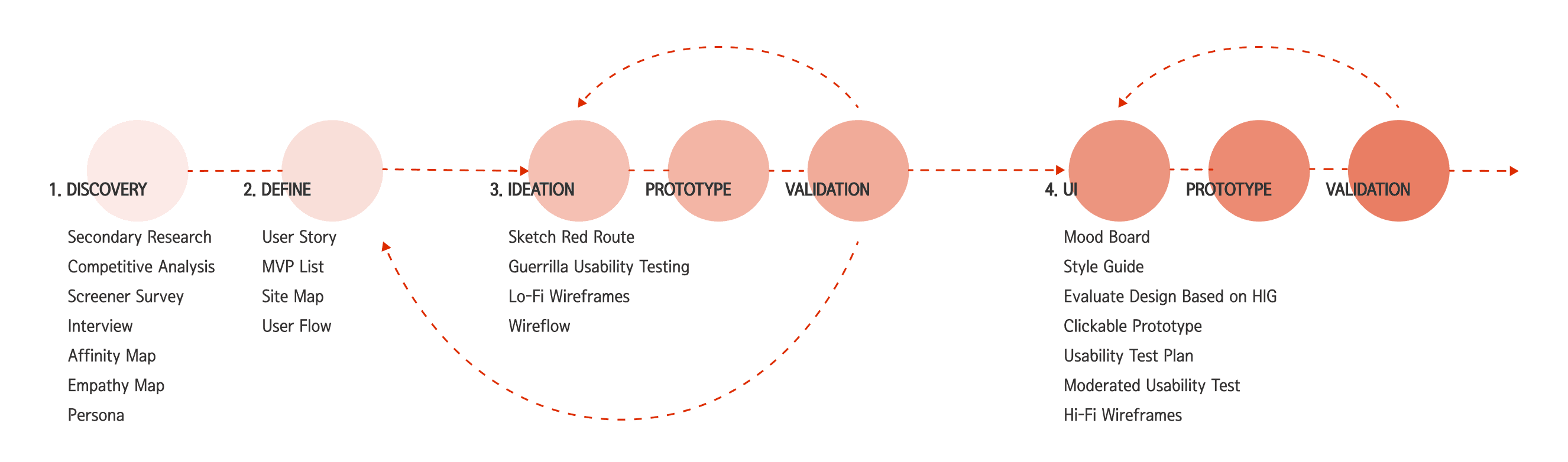
To begin, I conducted secondary research and discovered that an increasing number of people are relying on digital methods to search for food. Additionally, I found that a significant proportion of people enjoy trying cuisine from different cultures.
As the second step, I conducted a competitive analysis of three leading restaurant-finding apps. This revealed that current designs are suitable for general searches but lack customized suggestions.
User Interviews
Following initial research, I designed a screener survey and conducted interviews with participants meeting primary characteristics. The goal was to explore participants' likes and dislikes about current restaurant-finding methods, understanding their most frustrating aspects, and identifying opportunities for improvement.
Interviewed 5 people, each person about 30-45 mins
Interview Highlights
"At times, I found that reviews are not helpful for me due to cultural and cuisine differences between the reviewer and me."
“ I trust people who have the same taste like me.”
“I find it difficult to find authentic food on Yelp as the ratings and comments don't always provide helpful information.”
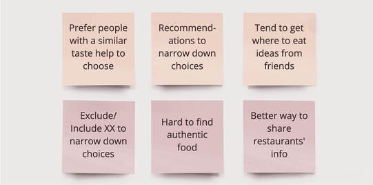
I crafted an affinity map to distill key points from interview notes, filtering out less important observations and focusing on those inspiring the design process. Through interview highlights and affinity maps, a prevalent issue with restaurant finding emerged: people often run out of ideas and prefer recommendations based on their taste.
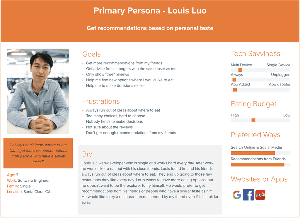
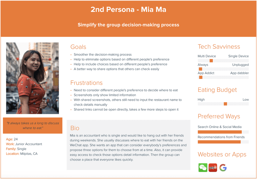
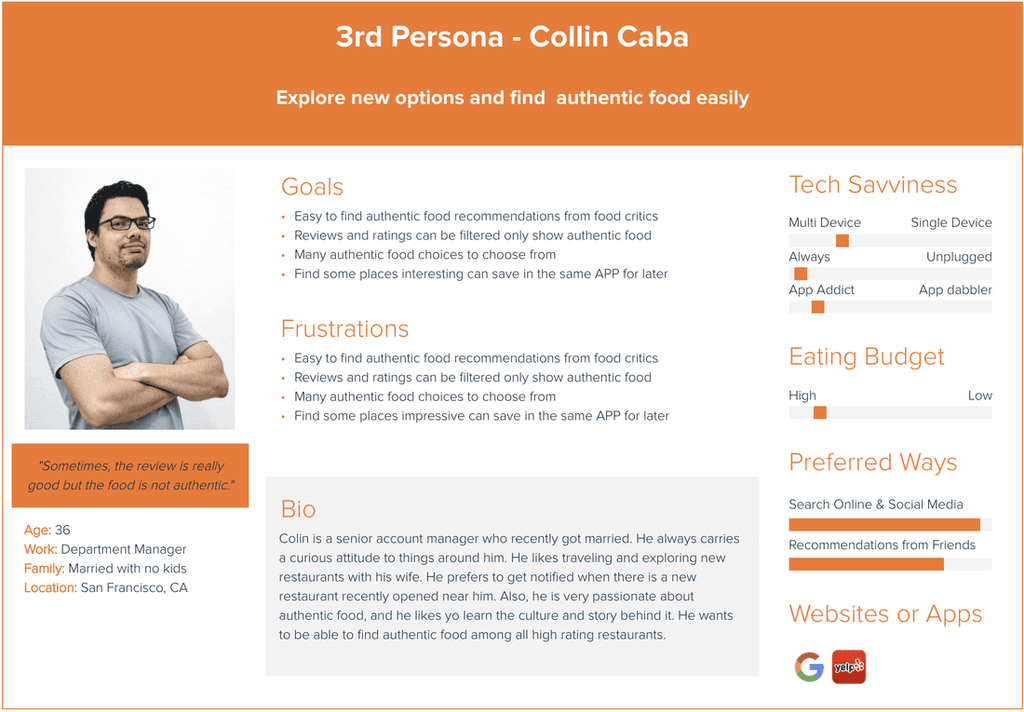
To organize insights from interviews, I created three empathy maps to understand users' pain points, goals, feelings, thoughts, and behaviors. Analyzing the data, I crafted three personas representing typical users, aiding in empathizing with my target audience for a better user experience.
2. Define
The discovery phase helped me understand the users' goals and major pain points. I elaborated on the data collected and compared it with the current state of restaurant-finding apps in the market. From there, I created user stories and developed an MVP list.
As a user who frequently struggles with deciding where to eat, my goal is to receive restaurant recommendations quickly and easily. Here is the MVP list:Prioritize mobile devices in the design.
Get recommendations
Search for a type of restaurants
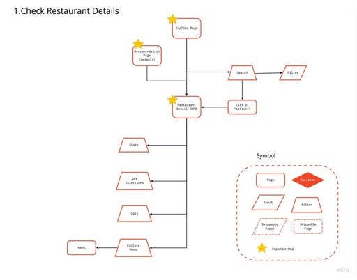
Check restaurant details
Provide inspirations of eating options
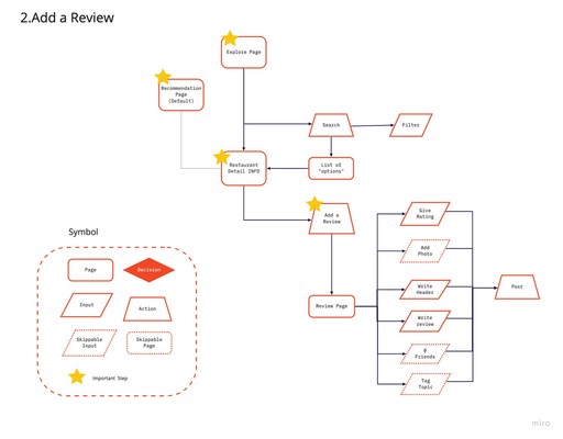
Share my personal eating experience
The MVP study helped me to decide to focus on the primary persona's needs in designing my app, while leaving the other two for future versions.
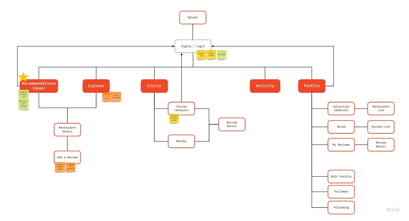
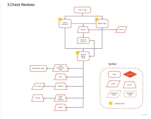
Refining my design focus for Foodea, I crafted an initial site map to streamline navigation and create an intuitive layout. Additionally, I developed initial user flows to enhance user focus on key tasks and minimize distractions while aligning with the app's main purpose.
3. Ideation | Prototype | Validation
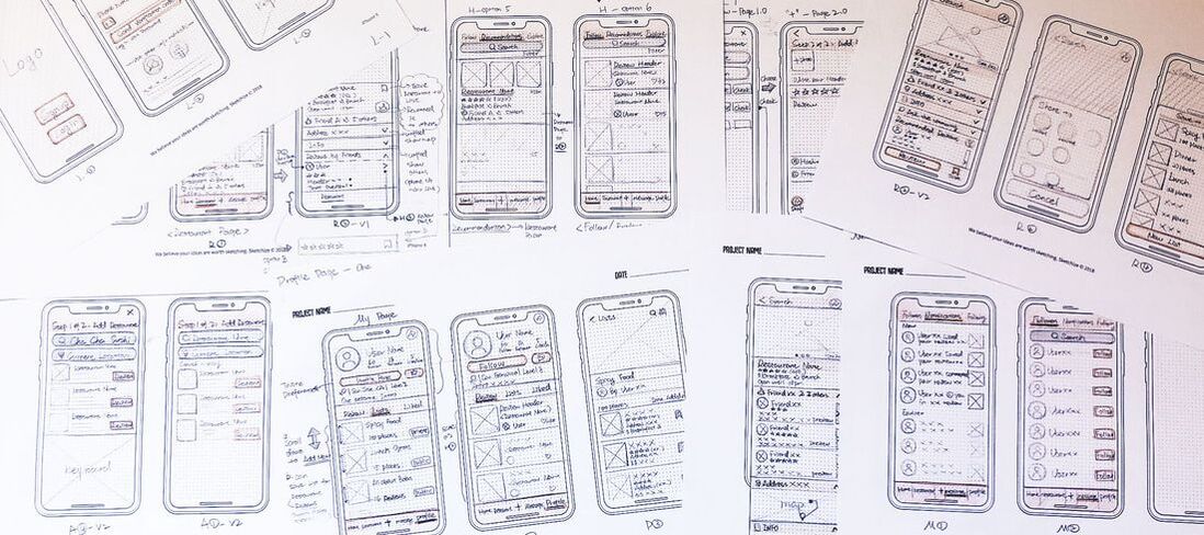
I created sketches of the main user flows in the app to communicate my ideas and receive feedback more easily.
Guerrilla Usability Testing
The objective was to use this quick and cost-effective method to understand what users liked about the design and which aspects were less intuitive.
Tested with 5 people, each person about 30-45 mins. Tool: Marvel
User quotes from testing:
"The design is interesting."
"It makes the restaurant finding decision-making process smoother."
"I am looking forward to using it."
Key findings:
Two options to "add a review" are confusing. Only one is needed.
The "Message" tab is unclear and confusing.
The current categories/tabs in the app make people feel confused.
Based on the findings from testing, I revised the site map and user flows to better organize all the content and ensure essential tasks are streamlined and easy to use.
Usability Testing Round Two
Based on the aforementioned updates, I developed low-fidelity wireframes and conducted a round of user testing with potential users.
Tested with 5 people, each person about 30-45 mins. Tool: Marvel
Go to Clickable Prorotype
Overall
Better category design but still needs more work
Key findings:
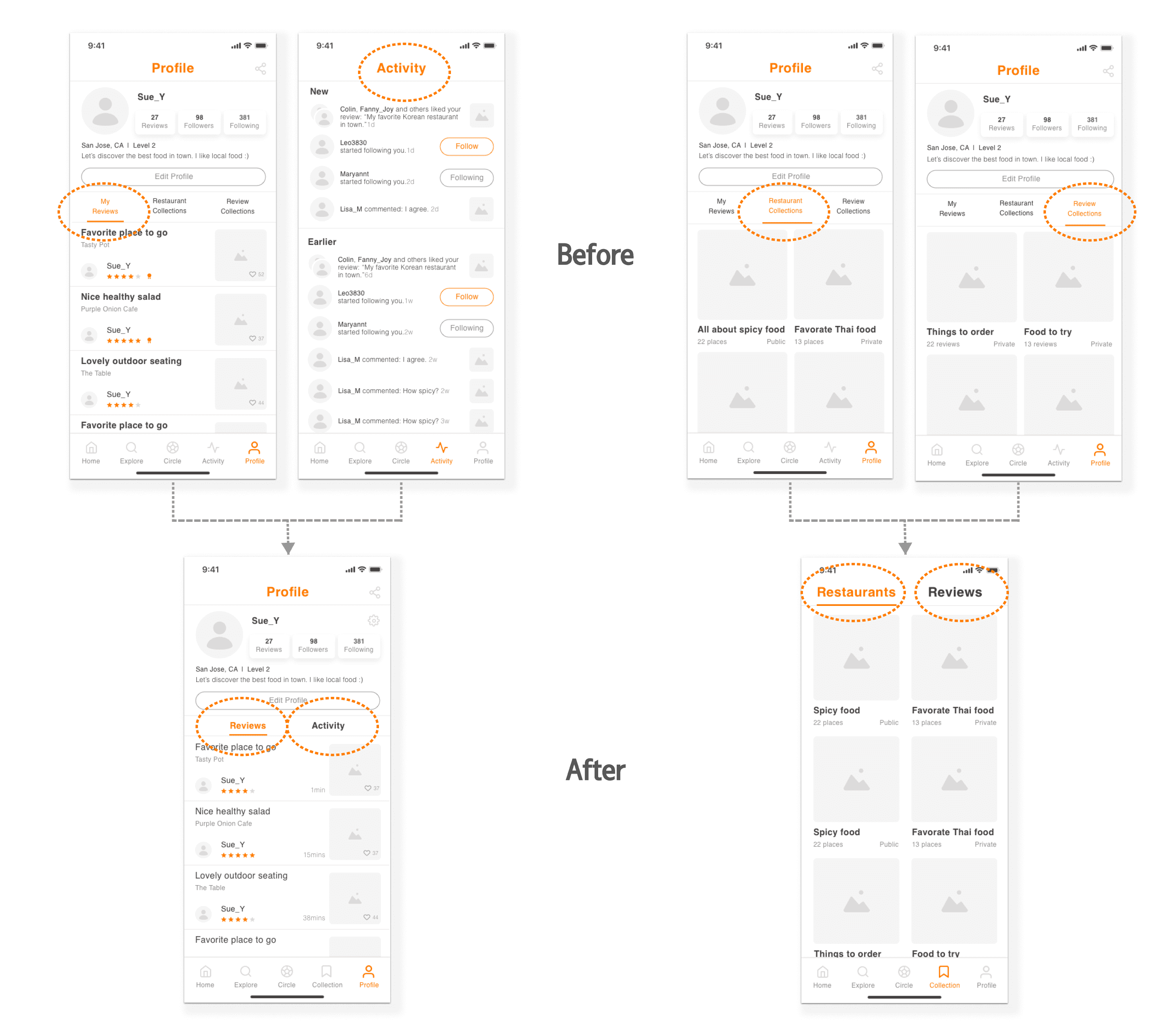
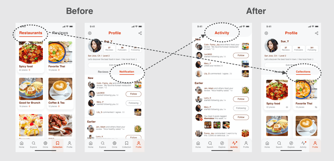
The users are getting confused about the subpages on the "profile page".
To do:
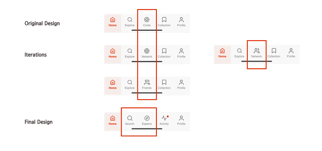
There are too many contents under the "profile page"--- To simplify, move “collection” features out as a new tab.
Move "activity" into the "profile page" to keep the bottom remain as five tabs.
I updated the deisgn and created a wireflow to clearly document various interactions and different states of the same screen.
4. UI Design | Prototype | Validation
For this step, I began by creating a Mood Board to help me define my ideas and set the tone for the project.
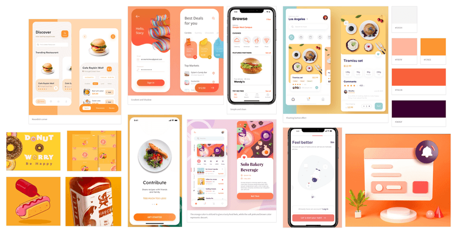
To evoke appetite and mental activity, I chose a color scheme blending red and orange zest. For a clean and user-friendly experience, especially on information-heavy screens, I utilized round corners with gradients and light shadows, creating a friendly and comfortable atmosphere.
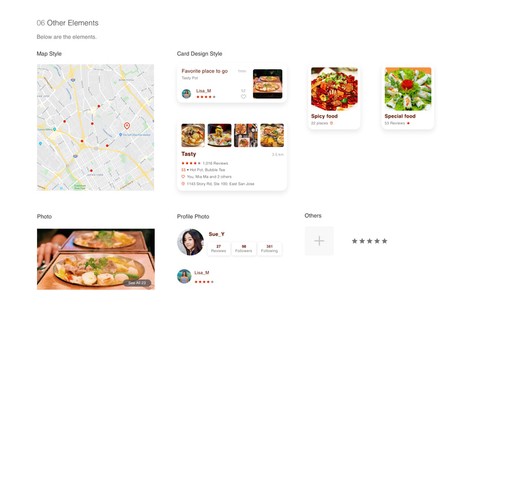
To create a unified look for this project, I designed a style guide and updated it consistently until I finished this whole project.
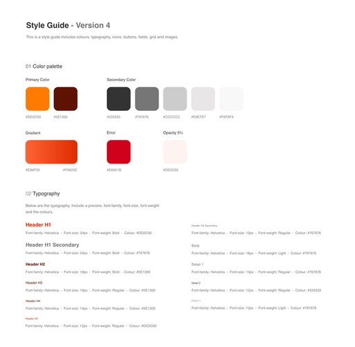
Human Interaction Guideline
To ensure engaging user experiences, I aligned my design with IOS guidelines (HIG), making necessary revisions to meet specific requirements.
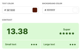
Use color to enhance accessibility for visually impaired individuals.
Avoid using the same color for interactive and non-interactive elements.
User Testing Round One
At this stage, I adhered to the style guide and incorporated user interface design into each screen. Using Invision, I developed a clickable prototype. Additionally, I created a usability test plan and conducted two rounds of moderated usability tests. My objective was to assess the app's design and verify that it's user-friendly and intuitive.
Each round tested with 5 people, each person about 30-45 mins. Tool: Invision, Google hangout
Key feedback:
"Collect a review" feature is not useful: Remove this feature
"Circle" tab name and icons are not very intuitive: Rename it and redesign the icon
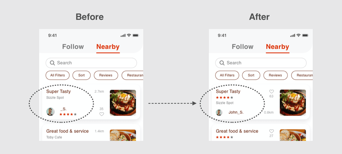
Rating stars under a user's name are confusing: Move the rating stars under the review title
Revise the copy and icon in the main navigation bar for improved intuitiveness.
To address the findings from the user testing, I made updates to my design.
Go to Clickable Prorotype
Following the implementation of the final design, users provided positive feedback, expressing enthusiasm for the new concept.
User feedback:
“Can’t wait to use it.”
“I think Foodea would be very helpful.”
“I particularly appreciate the feature that allows me to highlight my friends' reviews.”
“I'm in need of more restaurant recommendations, and I have high expectations of seeing a variety of new suggestions every time I open Foodea.”
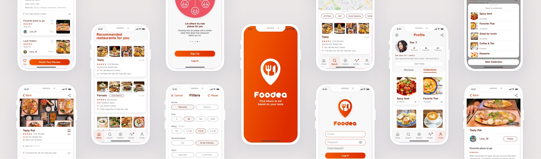
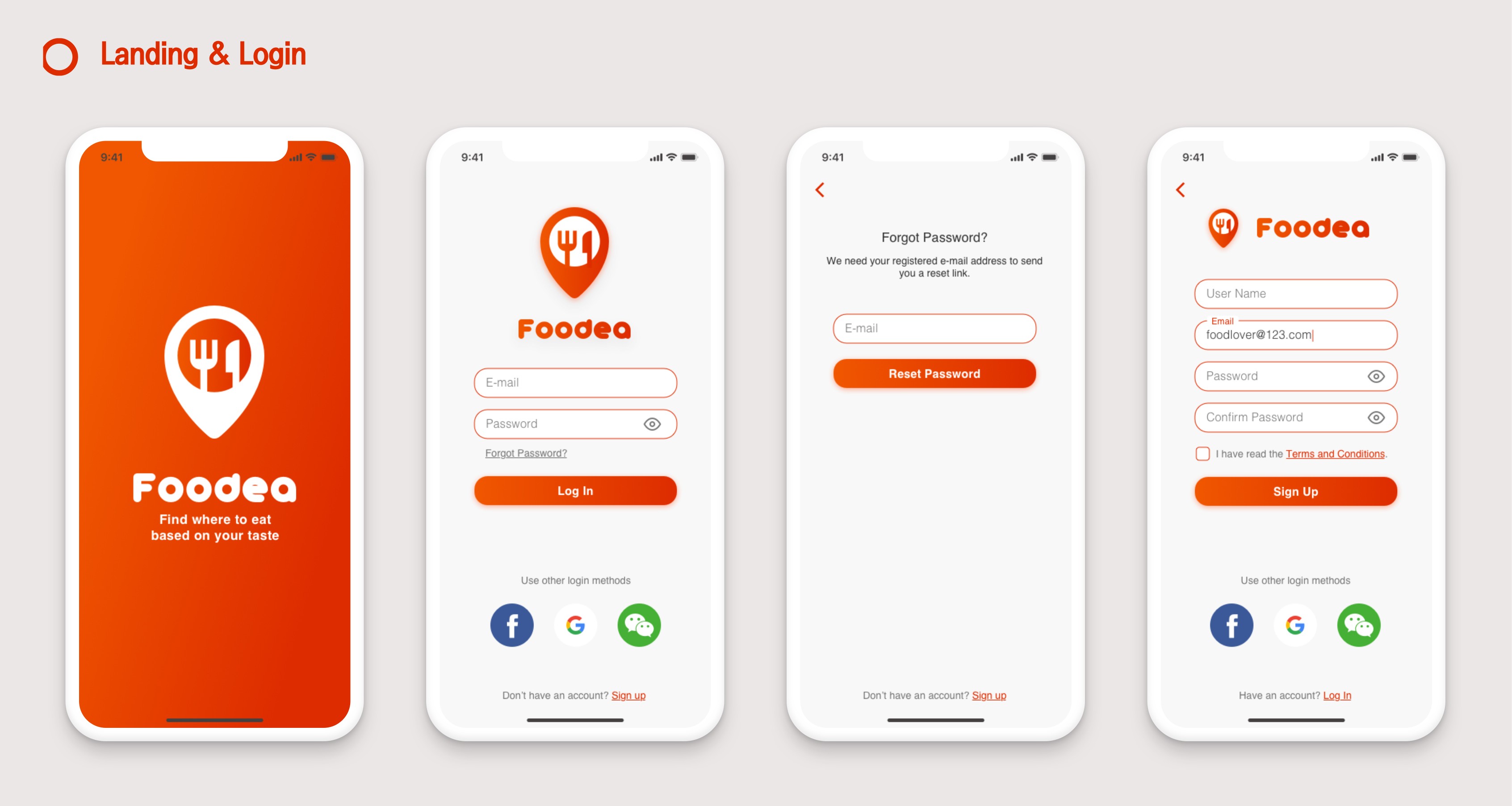
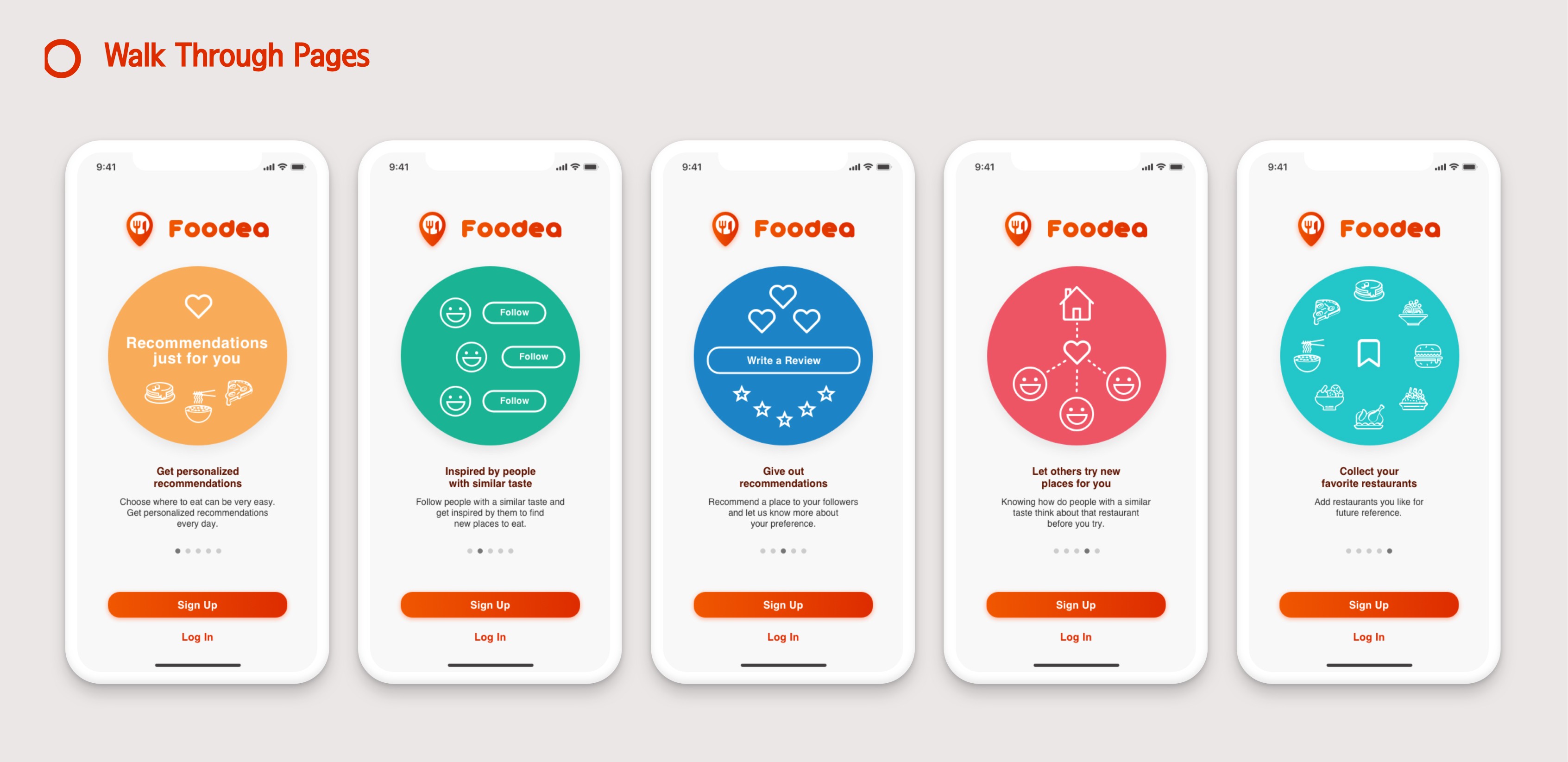
5. Hi-Fi Wireframes & Interactive Prototype
Below are HI-FI wireframes for key frame designs and the interactive prototype.
6. Thoughts
Developing an app from scratch presented numerous challenges, but I successfully managed the entire process, from research to the final UI version. Although I primarily focused on the basic features for this version, there is always room for improvement.
Next steps:
Add features to simplify the group decision-making process.
Improve the layout of the public profile page to make it easier for users to decide whether to follow or not.
Key insights:
During my research for Foodea, I discovered that people primarily want to view opinions on restaurants from their friends or individuals with similar tastes, as opposed to just relying on ratings from strangers.
Below are my takeaways from this project:
User communication, testing, and feedback are crucial for better design.
Regularly evaluating designs against industry guidelines helps avoid blind adherence.
Continuous improvement is key, acknowledging there's no perfect design.