

Order Wrangler
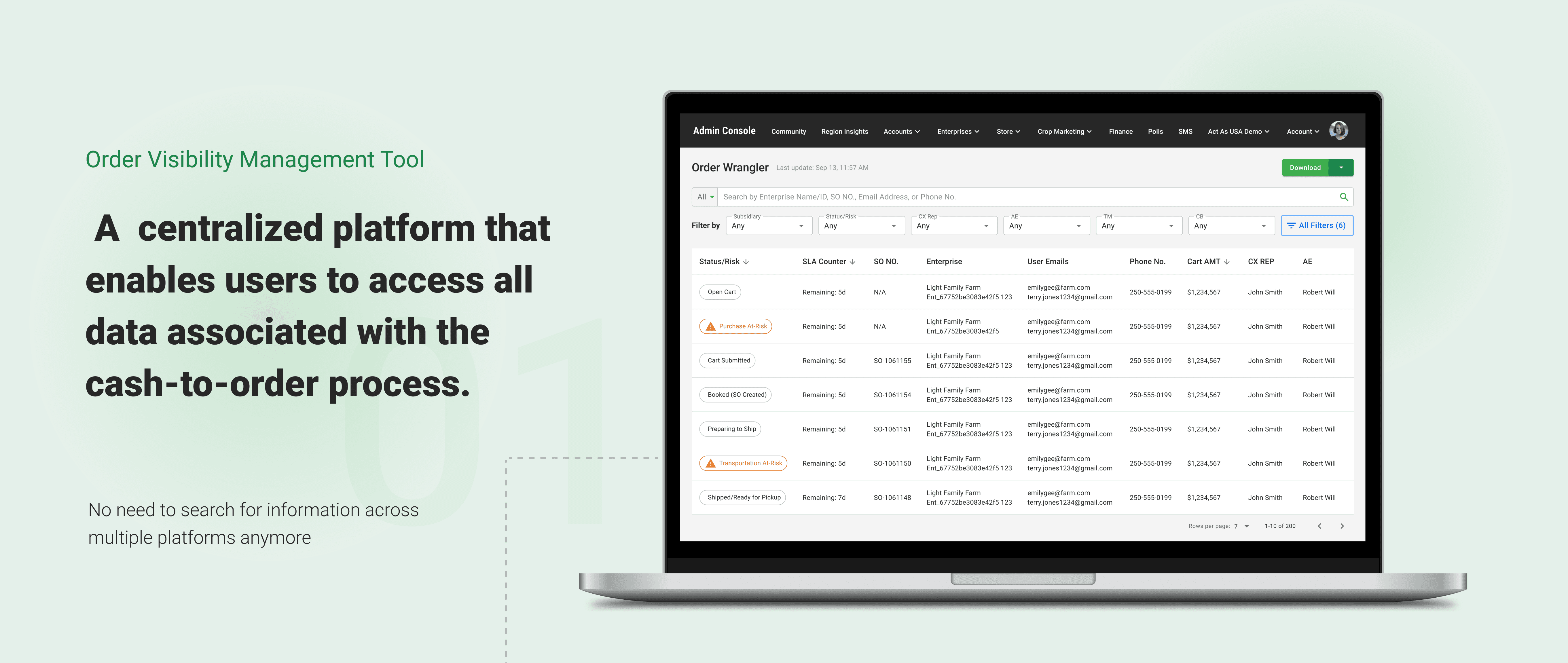
Order Wrangler is a centralized administrative platform designed to give Customer Experience (CX) and Operations teams full end-to-end visibility across the Order-to-Cash lifecycle. By consolidating fragmented data scattered across legacy systems, the tool dramatically reduces context switching, shortens customer call times, and increases operational efficiency.
Context & Problem Framing
The Order-to-Cash workflow depended on multiple legacy systems, each holding partial or inconsistent data. CX agents were responsible for answering order-related inquiries but lacked a single source of truth to trace issues from Cart → Order → Fulfillment → Delivery.
This operational debt resulted in:
• Excessive context switching between tools
• Long call times while agents searched for answers
• Limited ability to diagnose issues without escalating
• High promise risk due to visibility gaps
• Inconsistent or delayed customer communications
The organization needed a unified platform to surface accurate, end-to-end order visibility—without requiring a full system overhaul.
Business Goals & Success Metrics
We aligned with Operations and Fulfillment leadership to define key outcomes for Milestone 1 (M1):
Business Goals
• Increase operational efficiency and reduce handle time
• Provide a single, reliable source of truth for order status
• Reduce promise risk and improve accuracy of customer communications
• Empower frontline teams to diagnose issues independently
Success Metrics
• Reduction in in-season order processing time
• Reduction in average customer call duration
• Improved issue resolution speed
• Higher stakeholder and customer satisfaction
My Role & Team
Lead Product Designer. I was responsible for defining the M1 scope, leading all foundational research (16 focus groups), driving the information architecture, and partnering with engineering to ensure technical feasibility against design constraints.
• Influence: Successfully advocated for prioritizing Order Visibility over the more ambiguous Order Automation for M1, focusing the team on an achievable, high-impact business goal.
• Collaboration: Maintained alignment with Operations and Fulfillment PMs, and negotiated technical dependencies with the Engineering team (e.g., integrating with an existing enterprise design system and component constraints).
The Solution
The Order Wrangler dashboard provides consolidated data, eliminating the need for CX agents to jump between multiple separate tools, resulting in faster resolution times.
Design Process
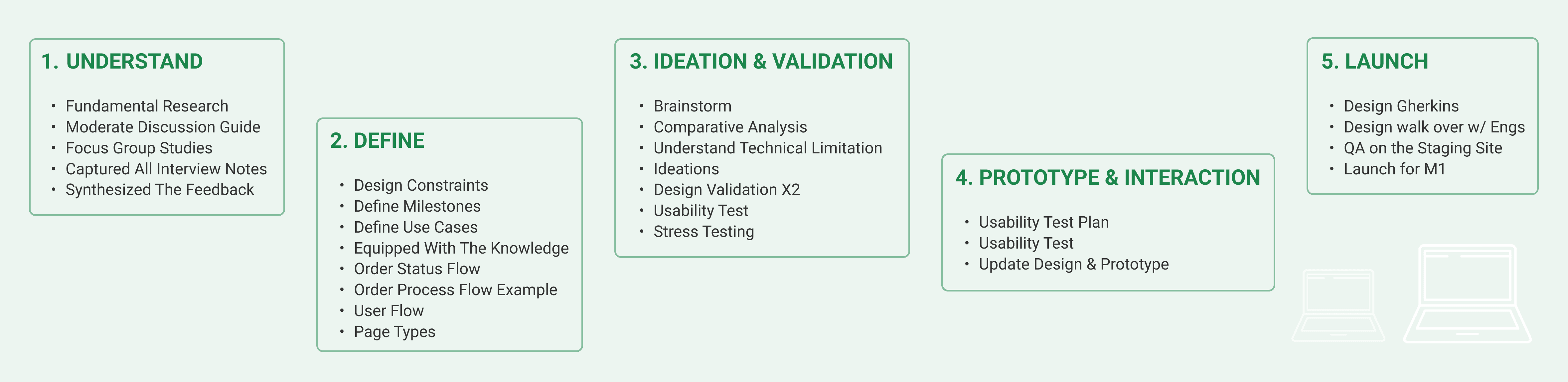
Strategy & Scoping: Defining Success
My process began by tackling initial ambiguity with internal research (16 focus groups) to identify high-impact areas. The research revealed two primary paths (Order Automation vs. Order Visibility)
• Strategic Pivot: We prioritized Order Visibility because it offered immediate, measurable benefits for reducing promise risk and directly streamlining complex Customer Experience (CX) workflows, aligning with M1's goal of fast impact.
• Design Constraint (M1 Focus): The initial release was deliberately scoped to be an Information-Only tool, exclusively for the CX Team (our primary user group), focused only on Desktop use.
This approach delivered fast, tangible value while setting the foundation for future enhancements.
Systems Understanding & Information Architecture
Given the complexity of the Order-to-Cash process, I collaborated closely with technical PMs and engineers to understand fulfillment logic, item-level relationships, shipment dependencies, and system limitations.
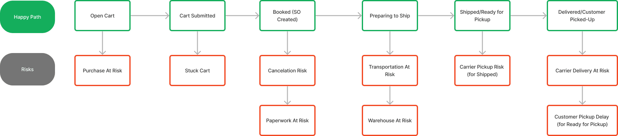
I translated this domain knowledge into:
• Data structures for the dashboard
• Clear hierarchical IA
• Definitions for item-level, order-level, and fulfillment-level views
• A scalable layout framework that could expand across future milestones
Key Design Decisions & Rationale
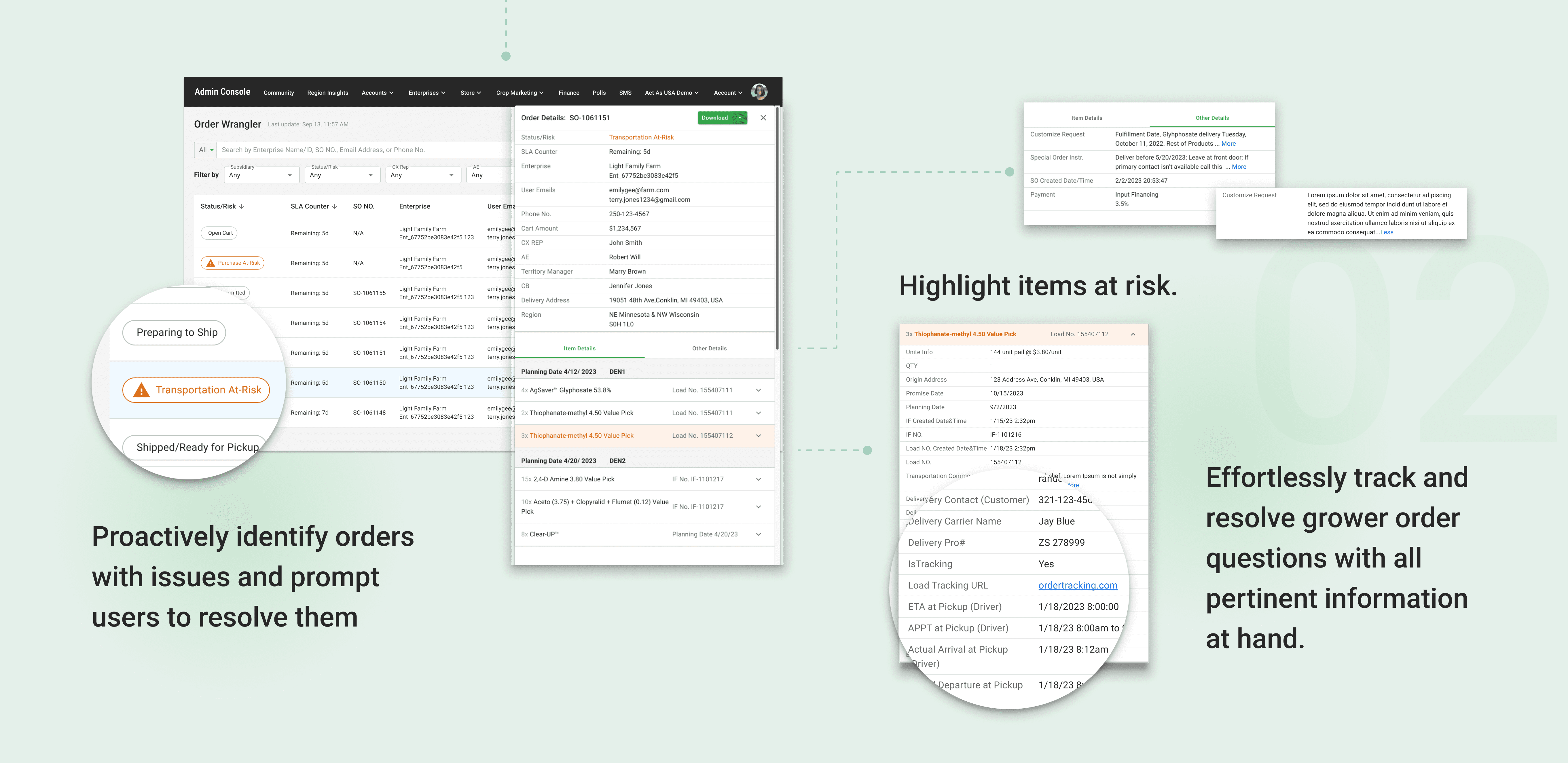
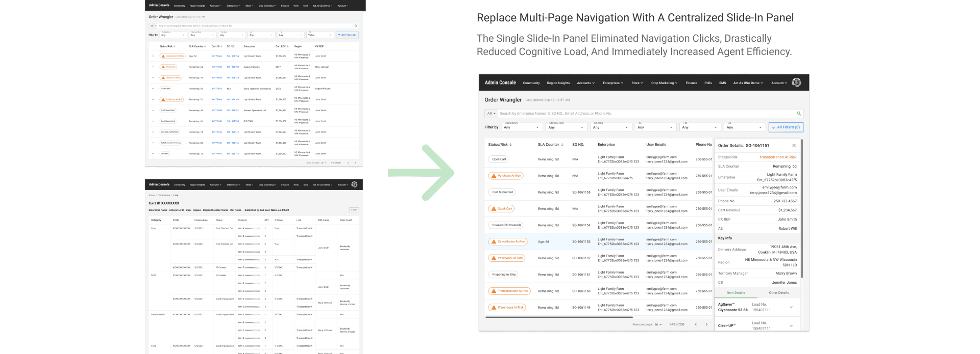
• The Decision (Pivot): We moved away from a multi-page design (requiring navigation to "Cart > Order > Fulfillment" etc.) to a centralized slide-in detail panel.
• The Rationale (Validated by Testing): Usability testing revealed that context switching was the #1 time sink and major source of error. CX users needed to scan all related information (order, fulfillment, cart details) simultaneously to answer a customer query. The single slide-in panel eliminated navigation clicks, drastically reduced cognitive load, and immediately increased agent efficiency.
Design Execution & Validation
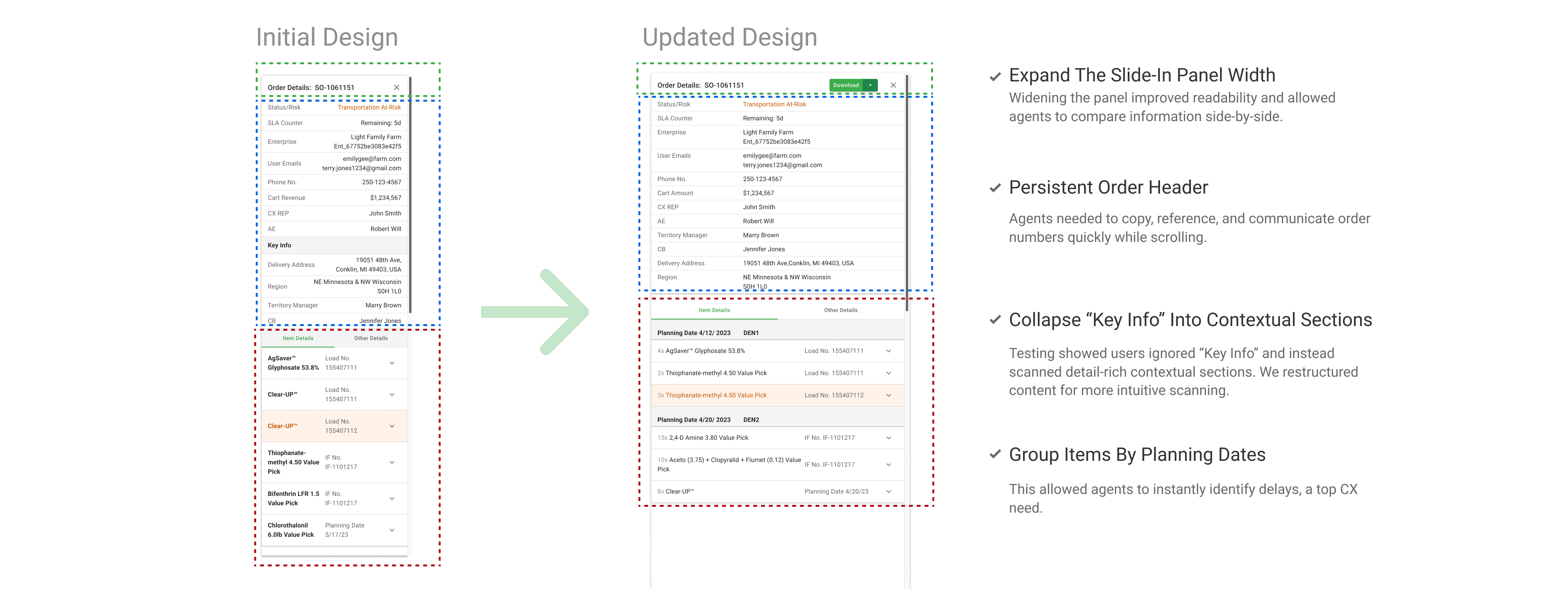
I created a modular component library aligned with the organization’s existing design system to accelerate engineering alignment.
The Validation (Usability Testing): I conducted scenario-based usability testing with five CX agents. Tasks focused on diagnosing order issues, reviewing item-level details, and identifying delays—mirroring real operational workflows and ensuring the design addressed the highest-impact use cases.
Outcomes: All participants successfully completed the tasks and expressed a clear preference for the consolidated slide-in panel. Users highlighted improved readability and scanning efficiency, and surfaced key enhancements—including increased spacing, persistent order headers, and the ability to share information in multiple formats—which directly informed the final design.
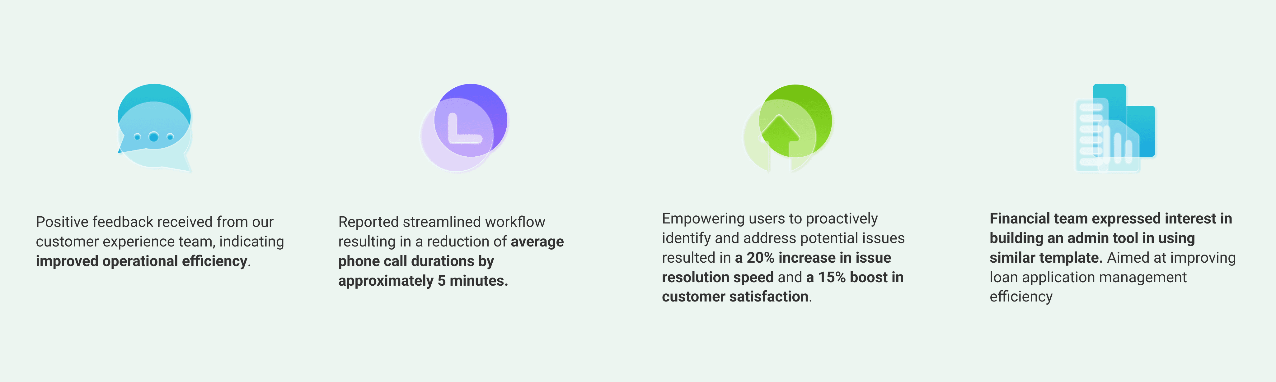
Impact and Outcomes
Following launch, the CX team gained a single source of truth that unified fragmented data into a consistent, actionable interface.
Key Takeaways & Next Steps
Strategic Scoping:
Successfully narrowed an ambiguous, broad problem (Order-to-Cash) into a focused, high-value solution (Order Visibility) that delivered rapid M1 results.
User-Driven IA:
Used qualitative data (context switching pain points) to drive a fundamental shift in information architecture.
Next Steps:
Gather stakeholder feedback to prepare for wider rollout, including developing mobile-friendliness for field use.