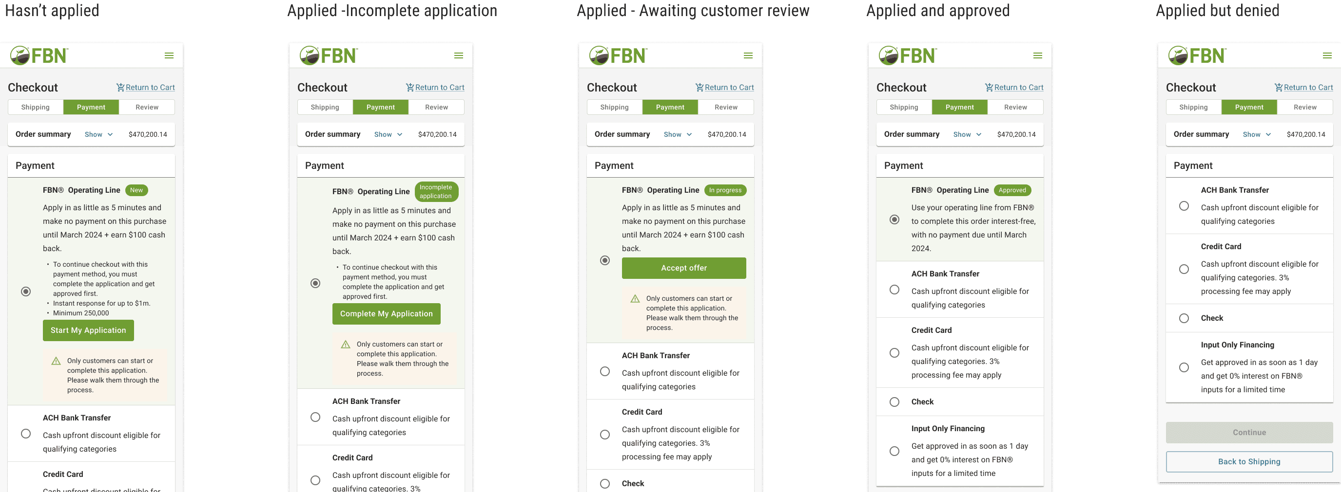
Pay by OPL: Streamlining Enterprise Payments
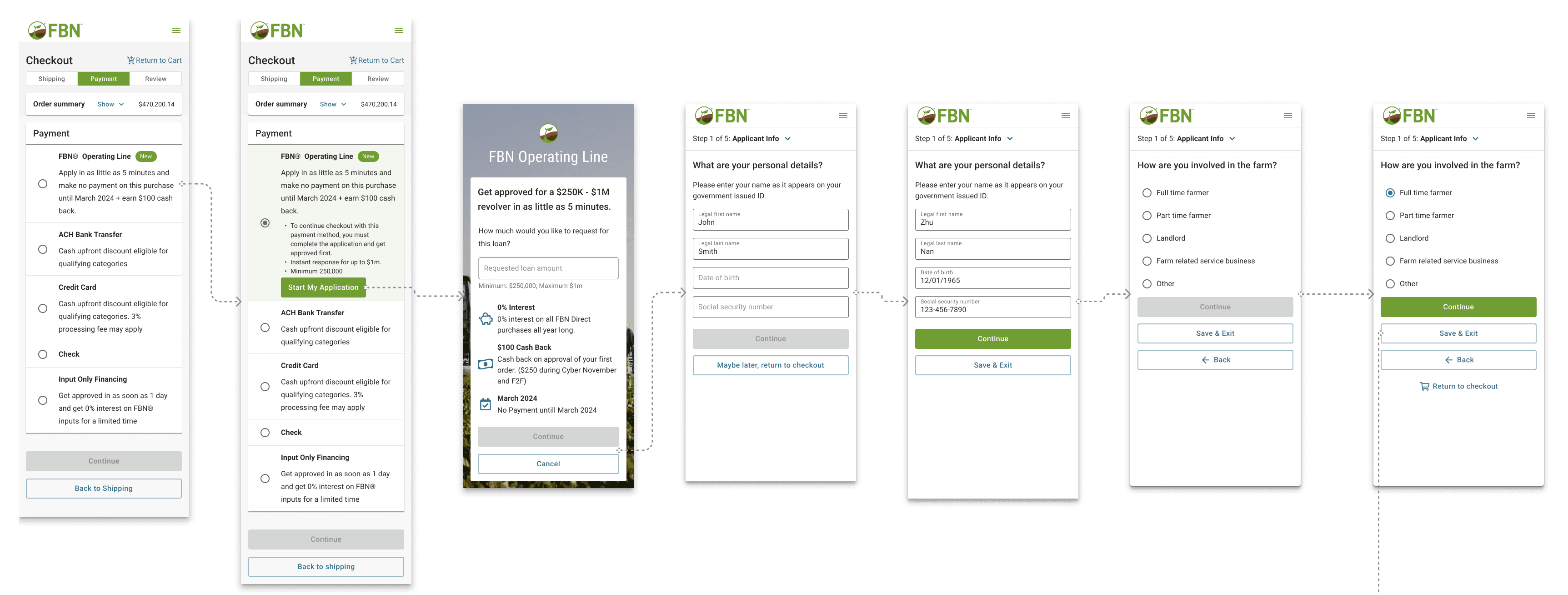
This project was a critical strategic initiative to bridge the gap between our financial products and our e-commerce platform, enabling high-value transactions by introducing a seamless loan application directly into the user checkout path.
Quick Project Snapshot
Timeline: The project was completed in a rigorous 5-week window, successfully meeting a non-negotiable pre-season launch deadline.
My Team: I led the Store Design efforts and collaborated extensively with a dedicated Finance Design Partner, PMs, and cross-vertical Engineering teams.
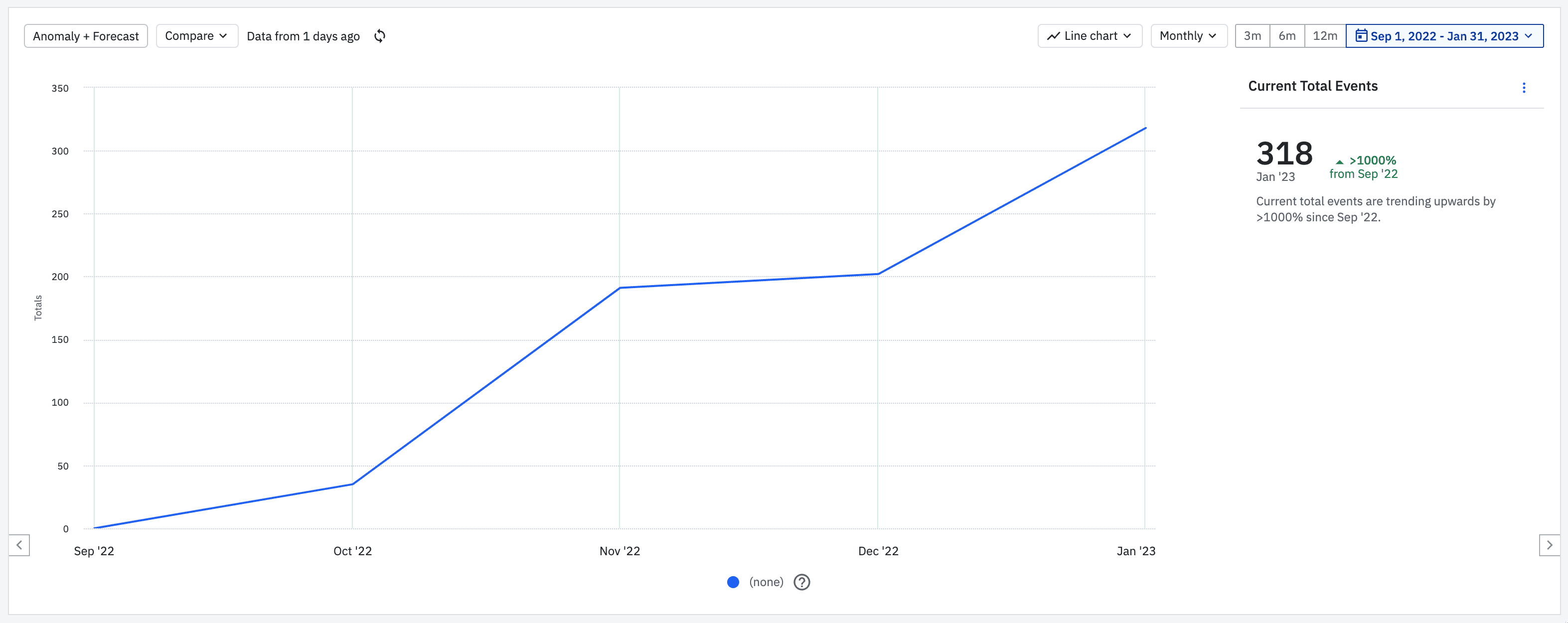
Initial Impact: The feature drove significant early results, with 318 users successfully applying for OPL via the checkout flow in the first three months post-launch.
Tools & Skills: The process leveraged my expertise in Figma, Figjam, Usertesting.com, and post-launch data analysis using Amplitude, demonstrating a full-cycle design approach.
Strategic Focus: The core design achievement was the Strategic Pivot to integrate the full loan application, which effectively eliminated significant anticipated operational debt for our CX and Finance operations teams.
My Role & Team
I served as the Senior Product Designer, taking the lead on the end-to-end design and user experience for the Store E-commerce integration.
My responsibilities included driving the strategic pivot from a simple visibility feature to a complex, integrated application flow, directly managing the project's scope expansion.
I was the primary design coordinator, ensuring alignment and seamless handoff between the Store Engineering team, the Finance team's design partner, and various non-technical stakeholders (Legal, Marketing, Operations).
I owned the validation and iteration process, utilizing rapid unmoderated user testing and post-launch Amplitude data analysis to optimize conversion.
Context & The Strategic Challenge
Business Context
FBN data showed that financed orders accounted for ~80% of total booked value for U.S. customers. Despite this, the newly launched Operating Line could not be used directly in checkout.
The Problems We Needed to Solve
Revenue friction: Customers had to manually withdraw OPL funds before purchasing, reducing conversion on large orders.
User friction: Farmers were forced to leave checkout mid-purchase, increasing abandonment risk.
Organizational complexity: Store and Finance were separate verticals with different systems, constraints, and incentives.
Design Challenge
Integrate a complex financial product into a high-stakes checkout flow without increasing abandonment, without adding operational burden, and without extending the deadline.
Strategic Pivot: From Visibility to Integration
Initial Direction (Rejected)
Our initial, simple approach was to merely surface OPL visibility and handle applications post-order submission. However, through initial stakeholder reviews, a critical challenge emerged.
Critical Insight from Stakeholder Reviews
The Strategic Barrier: The initial approach would have transferred the entire burden of manual follow-up, approval, and order management to our Customer Experience (CX) and Finance Operations teams. This created a massive, unsustainable amount of operational debt.
Design Decision
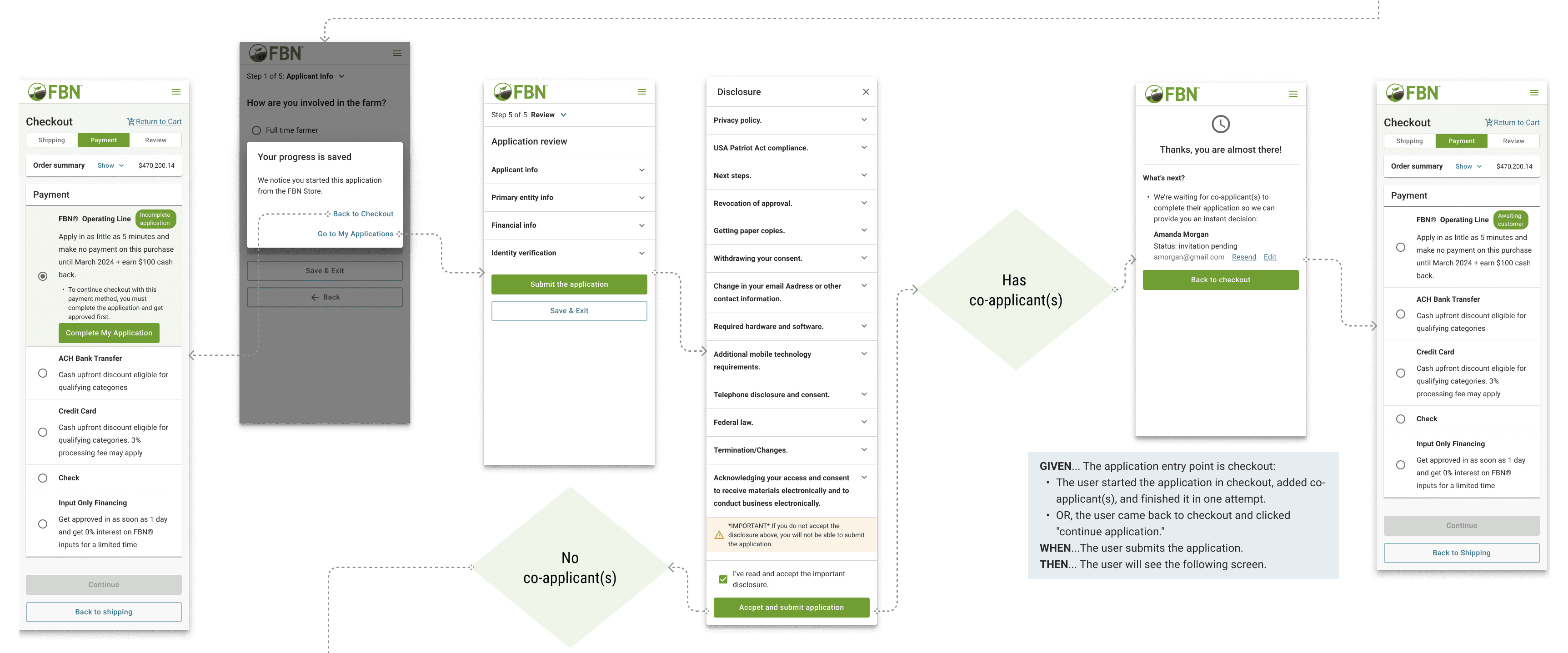
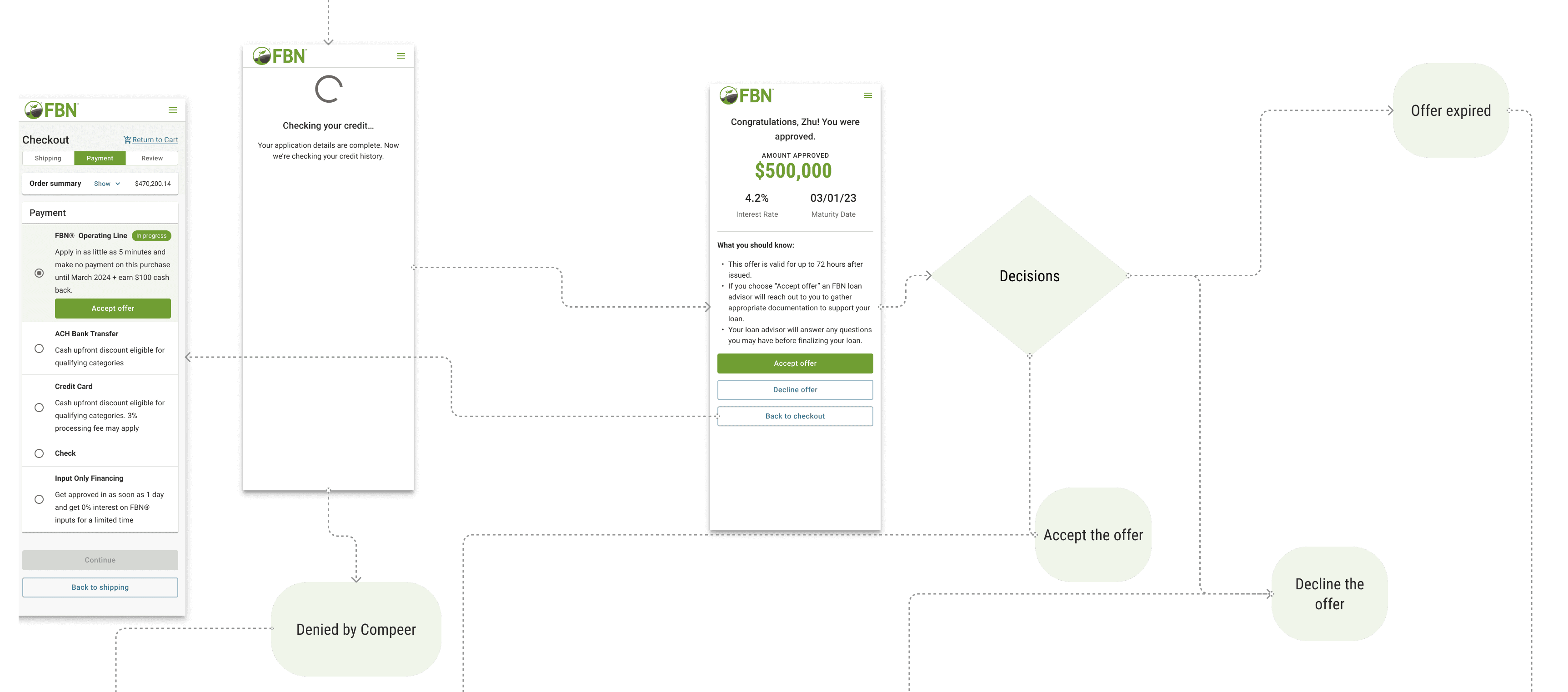
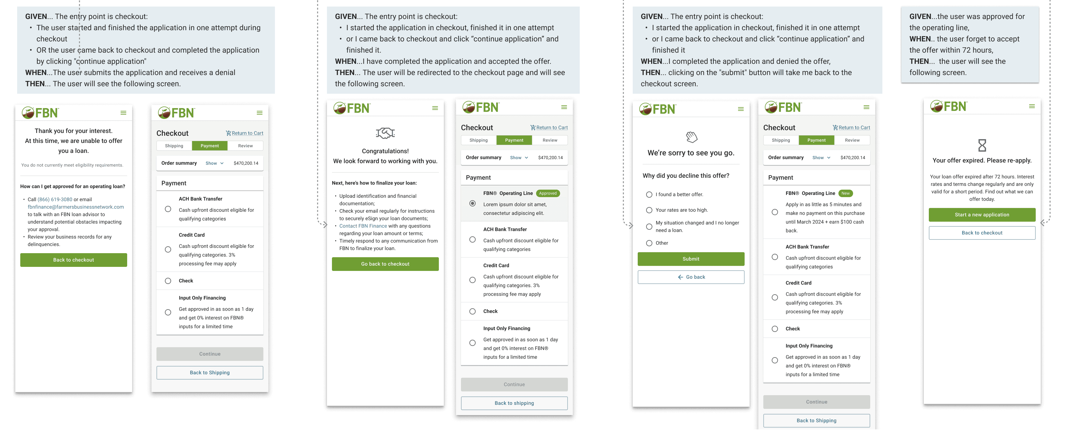
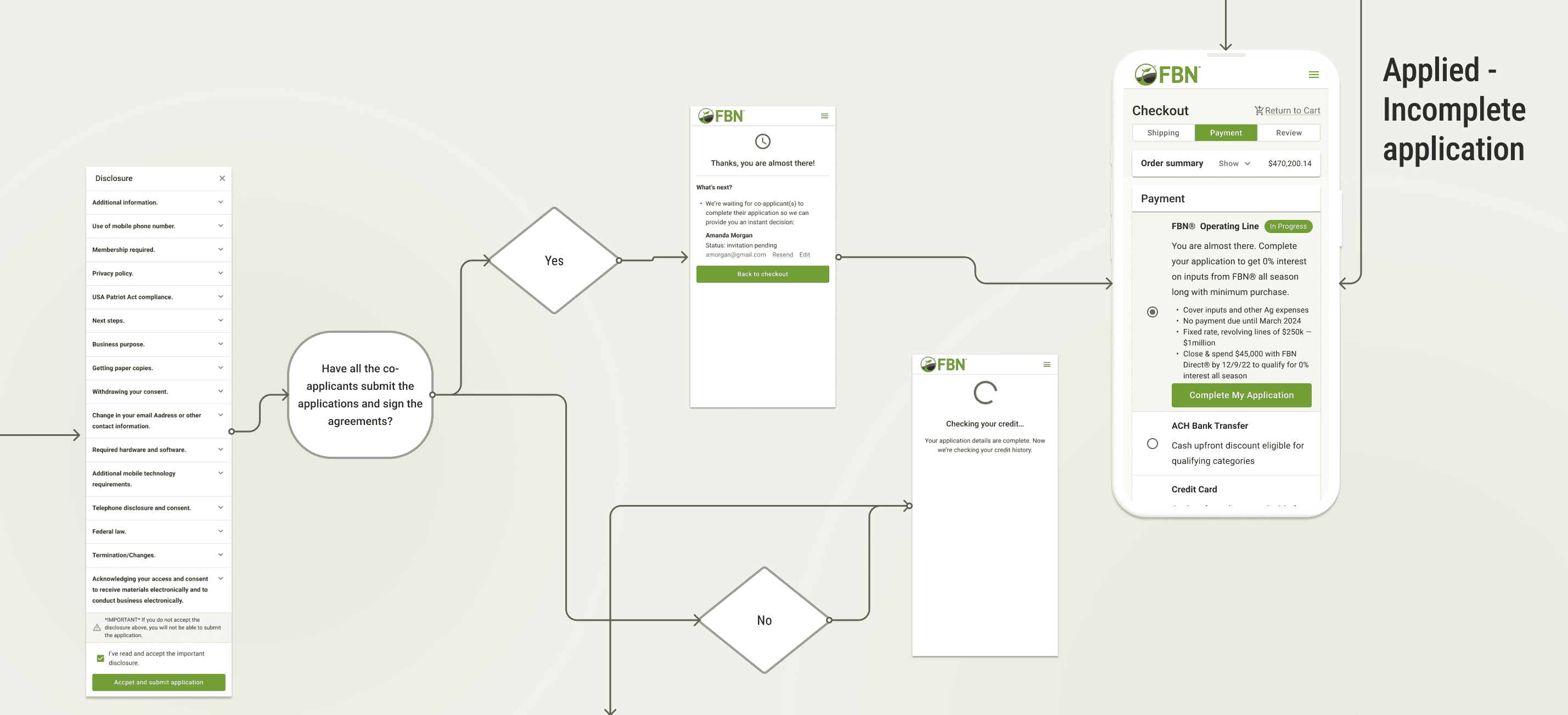
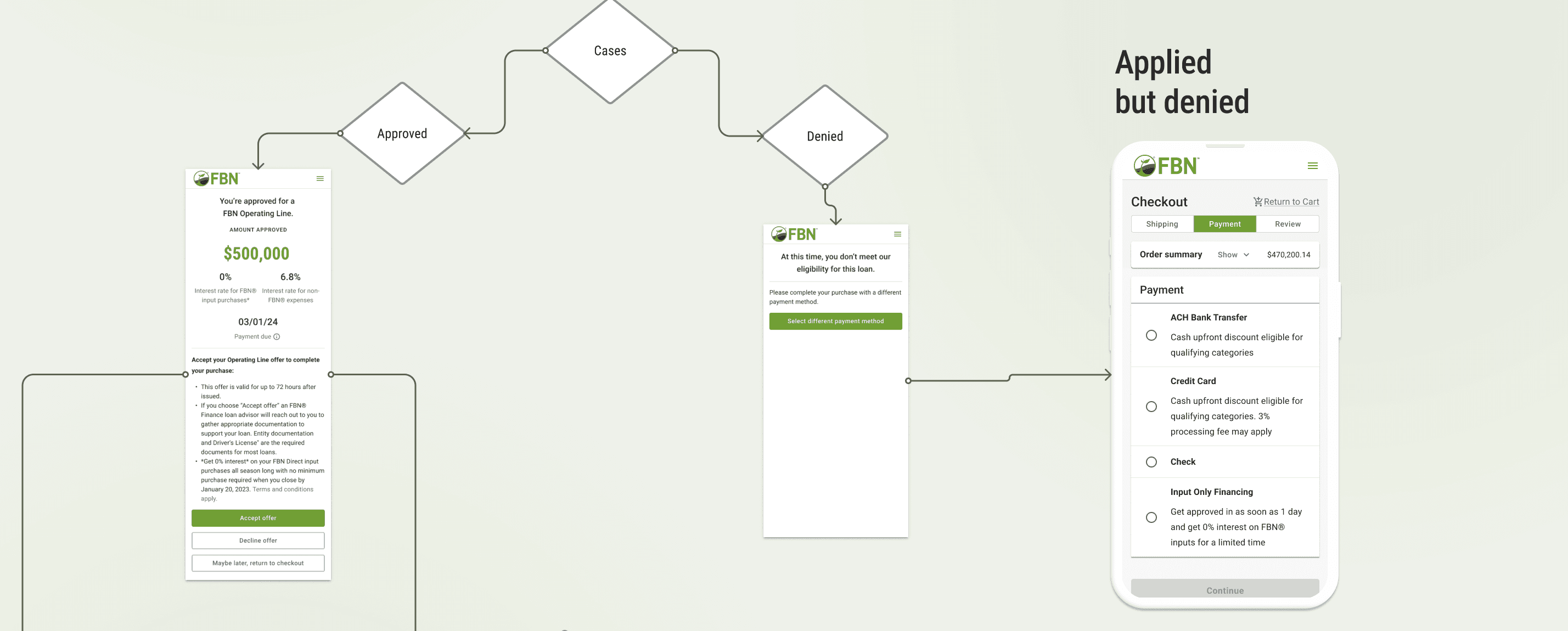
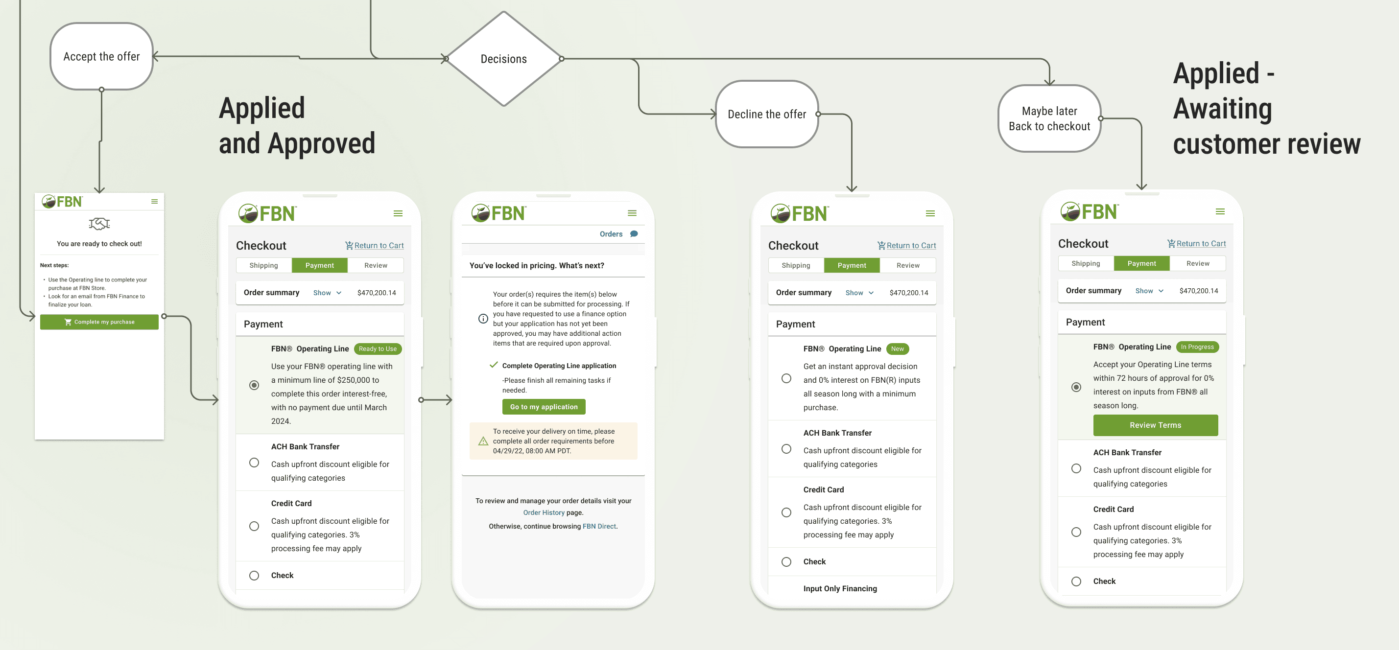
I advocated for and led the design team's strategic pivot to an enlarged scope: embed the entire OPL application process directly within the checkout flow.
This critical decision increased the project's technical and design complexity, but it was essential because it:
Eliminated Operational Debt: Automating the application at checkout removed manual processing for the CX/Ops teams.
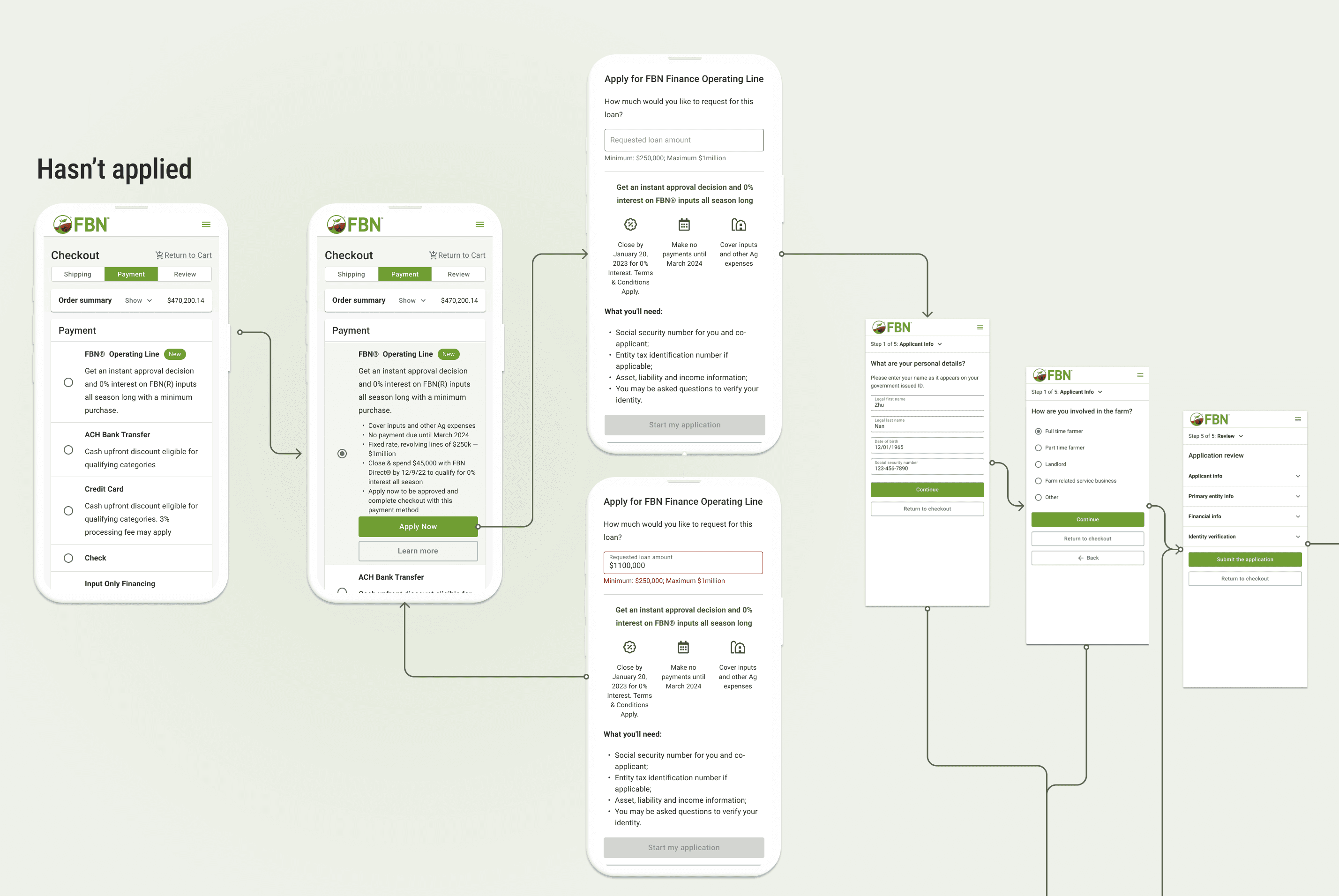
Maximized User Completion: Integrating the application directly into the flow ensured users could complete the financing step and their order in one session.
Process & Cross-Functional Execution

The scope change necessitated high-velocity, coordinated execution across multiple silos to meet the 5-week deadline.
Design Partnership
I collaborated intensely with a designer from the Finance team. I led the e-commerce checkout design and flow integrity, while the partner managed the technical application form integration.
Engineering Collaboration
We held daily sessions with engineers from both the Store and Finance verticals to understand technical constraints for linking the backend systems, ensuring the application could be initiated and paused without breaking the e-commerce cart session.
Compliance & Content
I worked directly with the Legal and Marketing teams to finalize precise, legally compliant, and consumer-friendly copywriting for the OPL disclosure and button calls-to-action (CTAs).
Key Design Considerations
Abandonment Risk: Avoid redirecting users away from checkout
Psychological Safety: Reduce anxiety around “applying for a loan”
Flexibility: Allow users to return to checkout at any point
Operational Visibility: Ensure orders and applications surfaced correctly for internal teams
Validation & Iteration
To mitigate the risk associated with adding a complex finance process to a high-stakes checkout funnel, we executed rapid unmoderated user testing.
Methodology
We used a clickable prototype with five target users to specifically assess points of friction and application anxiety.
Key Findings
Users expressed hesitation and anxiety when clicking buttons that implied they were immediately committing to a loan. There was also a need for an easy path back to the store checkout if they decided against financing.
Design Responses
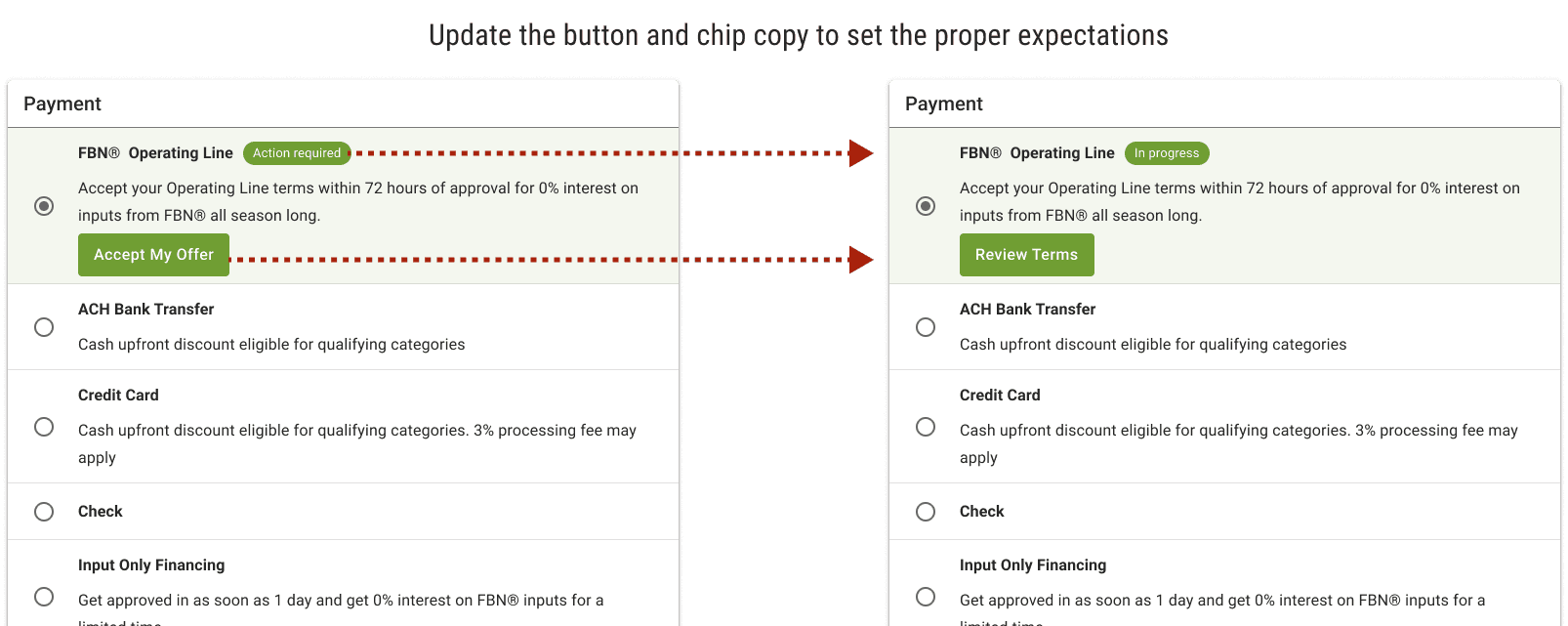
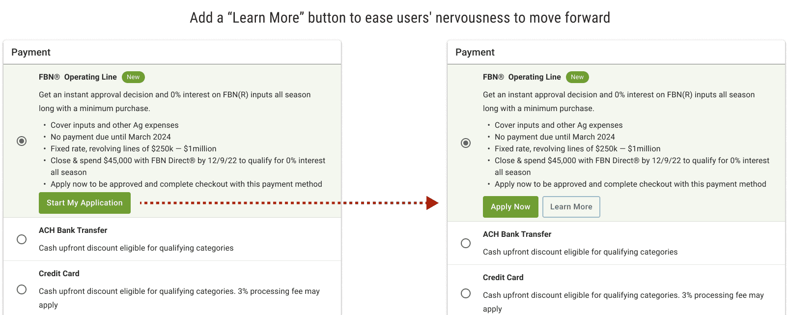
Button Copy: I refined CTAs to be more reassuring (e.g., from "Start Application" to "Apply Now").
Return Flow: Integrated clear, non-punitive paths allowing the user to return to the payment method selection at any point during the application.
Information Placement: Strategically integrated the "Learn More" link to address compliance needs without interrupting the primary application flow.
Launch
Launch: End of October (pre-season deadline met)
Quantitative Impact & Insight
Quantitative Impact
318 OPL applications completed via checkout in the first 3 months
Clear upward adoption trend despite cash remaining the dominant payment method
Post-Launch Insight (Data vs. Assumption)
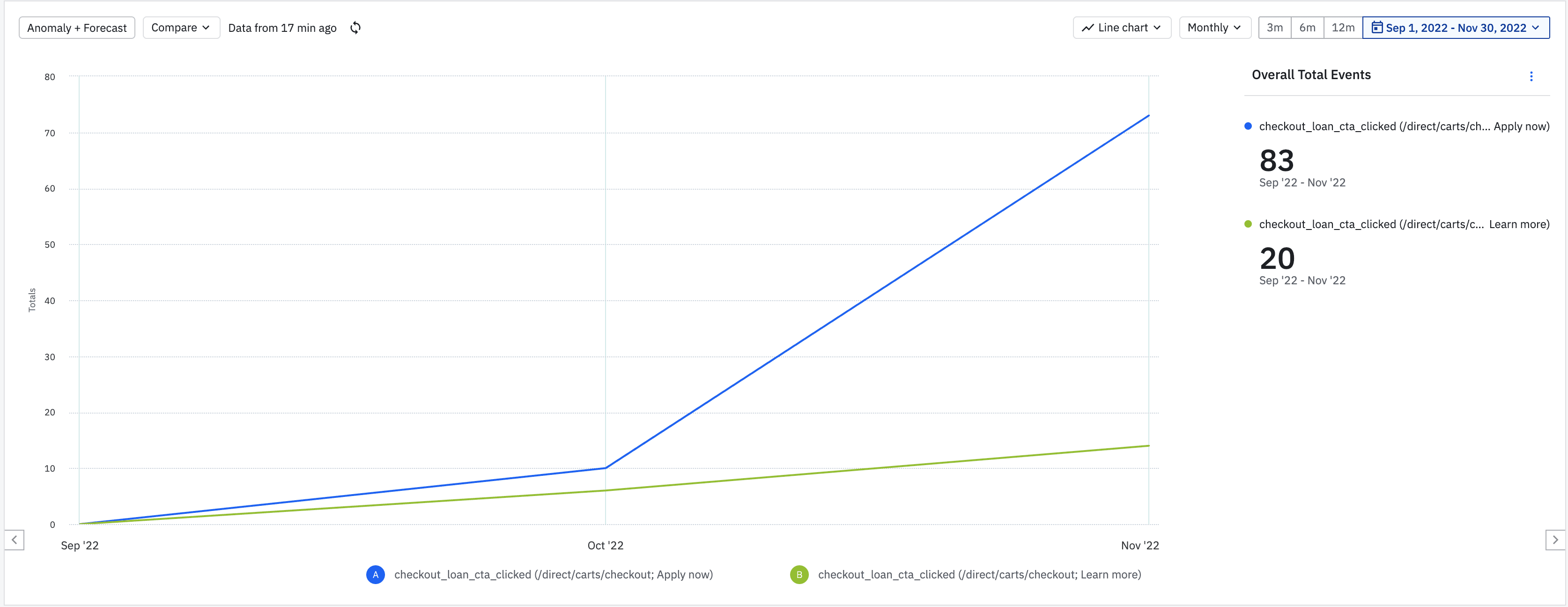
Using Amplitude, I analyzed interaction data and found:
Only 20% of users clicked “Learn more”
The majority proceeded directly to apply
Insight: For high-intent users, speed outweighed information depth—challenging assumptions formed during qualitative testing.
This insight informed subsequent financing feature designs by prioritizing flow efficiency over optional detail.
Takeaways & Leadership Reflection
Strategic Scope Management: Successfully navigated a 100% scope increase without extending timeline.
Operational Design Thinking: Designed for users and internal teams—reducing friction and operational debt simultaneously.
Data-Informed Iteration: Used post-launch analytics to validate (and challenge) research insights and inform future product decisions.
Cross-Vertical Influence: Acted as a connective tissue between Store, Finance, and Operations to align outcomes under pressure.

