Strategic Planning & Consensus Suite
Global Promotional Modeling for a Multi-Billion Dollar Retail Ecosystem
Enterprise Platform
Financial Modeling
Multi-Stakeholder Consensus
0 → 1
My Role & Team
Role: Lead Product Designer
Scope: System architecture, UX, Data modeling, Validation logic, Post-launch governance
Team: Product, Finance, Engineering, QA
Platform Type: Enterprise financial planning system
Problem Statement
Finance teams were making billion-dollar quarterly decisions on stale data, reconciled manually over email, with no shared version and no audit trail. My job was to build the system that fixed that — from zero.
The Snapshot — What Made This Hard
Three layers of complexity, stacked:
1 — Perpendicular user mental models
Two user groups navigated the same data from completely opposite axes. Creators owned one partner across all lines of business — horizontal. Validators owned one line of business across all partners — vertical. The platform had to resolve both without splitting into two separately maintained experiences.

2 — Relational data architecture from scratch
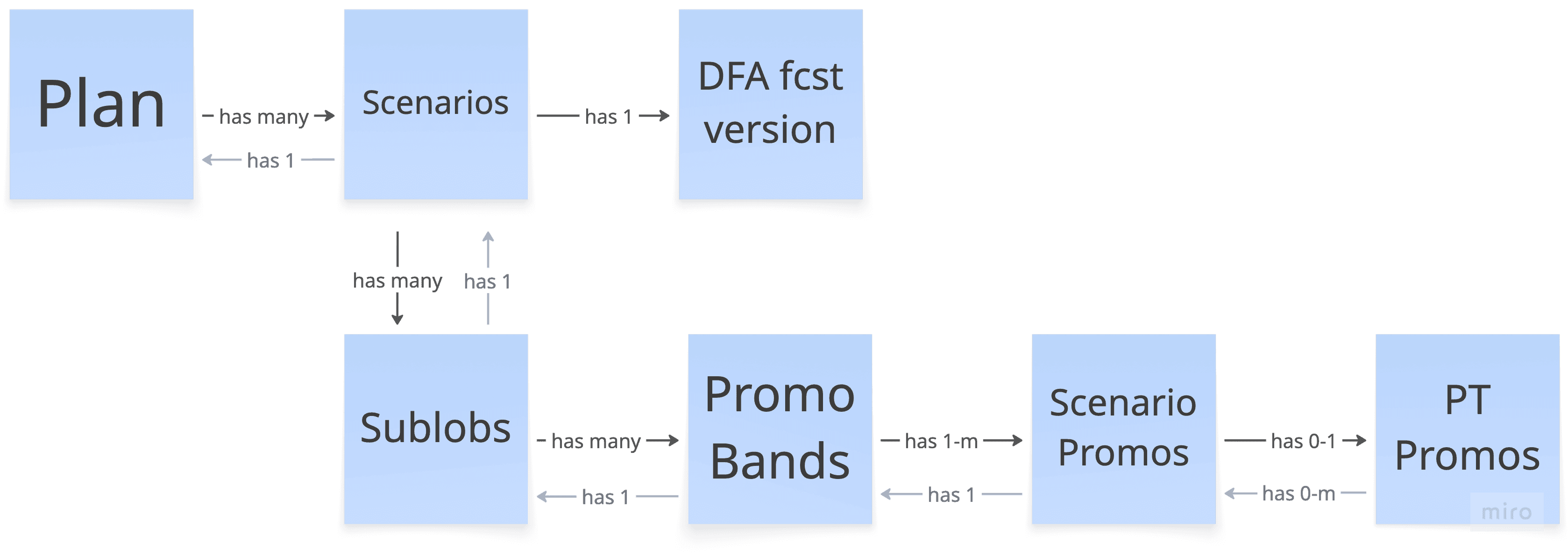
The instinct was to digitize the existing Excel structure. I pushed against that — defining a full relational data model from plan → scenario → sub-LOB → promo band → promo. That structural decision is what made every handshake between creators and validators traceable.
3 — Expert density at financial data scale
This wasn't a tool that could be simplified. The data model alone — spanning users, forecasts, plans, scenarios, sub-LOBs, promo bands and individual promos — required careful decisions about what to surface, when, and for whom. Every field had business logic behind it. Getting the information hierarchy right was as much a data design problem as a UX problem.

Discovery — Identifying the "Broken Handshake"
The PM had run interviews before I joined. Rather than waiting for a summary, I went directly to the recordings myself — over 20 sessions — and ran my own independent affinity mapping. I needed to form my own mental model of the problem, not inherit someone else's conclusions. What I found wasn't a feature list. It was a structural breakdown in how two groups were meant to collaborate.
The Root Cause: Data Sovereignty vs. Agility
Strict security policies prohibited public cloud tools, forcing both teams into offline silos — manually reconciling local spreadsheets over email with no shared version and no audit trail.
The Business Impact:
The Rework Loop — Every misalignment between creators and validators triggered another cycle, pushing alignment past the deadline.
Compressed Decisions — Delays dangerously narrowed the window leadership had to make billion-dollar portfolio choices.
No Audit Trail — Changes reconciled over email meant version history was permanently lost.

Three User Groups. One Critical Relationship
Two groups. Same data. Opposite organizing logic.
Creators — Responsible for one partner across all LOBs. Build plans and propose price impact assumptions against the current forecast. Navigate horizontally across the data.
Validators — Responsible for one LOB across all partners. Own the forecast itself. Come in to verify whether the creator's plan holds up. Navigate vertically across the same data.
Leader Group — Drive portfolio strategy. Review across all partners and LOBs.
The real design challenge: because Creators and Validators own different axes of the same data, they approach the platform from completely opposite directions. That's what the design had to resolve.

Mapping how these two groups were meant to collaborate revealed three critical handshake moments — and exactly where the process was breaking down.

Key Design Decisions
Decision 1 — One unified view, not two role-specific experiences
Early research surfaced a quiet signal: users would prefer role-tailored views. It wasn't a strong demand — a passing comment — but I took it seriously enough to map both sides explicitly with my PM before any mockups started. Roles rotated frequently. Top-level data needs were shared. Two experiences would double the build and maintenance cost. We aligned on one unified view — creators as the primary frame, validators fully covered within that structure — before a single wireframe was drawn.

Decision 2 — The layout follows the data, not the role
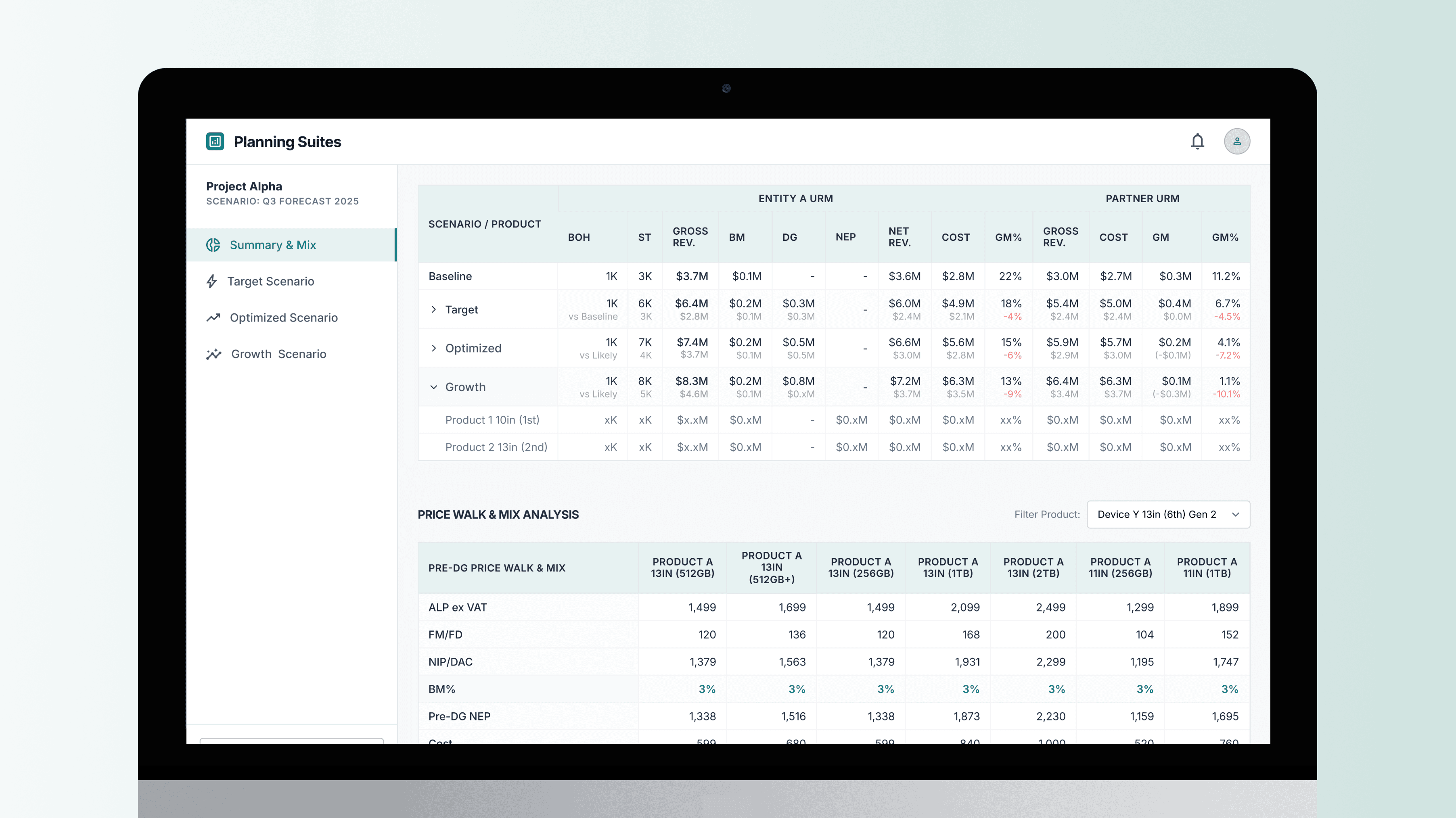
Both groups looked at the same key data: the forecast, the promo plan, price impact, and sized DG. That common ground became the anchor for the layout. Forecast at the top — you can't evaluate sizing without it. Sized DG summary below — the immediate comparison point. Working area at the bottom — where creators enter price impact and validators verify it. The hierarchy wasn't arbitrary. It followed the logical dependency of the data itself.


Decision 3 — Progressive disclosure over data reduction
Rather than stripping data to manage cognitive load, I structured a three-tier disclosure model. The weekly sized DG summary is visible by default — the shared reference point for both groups. Creators can expand into daily granularity and delta tracking when fine-tuning. Validators never need to go deeper than the summary layer. Density is a feature — organized, not stripped away.

Decision 4 — Promo banding from direct user testing
The workspace needed to handle plans ranging from a handful of promos to many — depending on the line of business. I brought two solutions to users: grouped discount tiers with tabbed entry, and a banding model where shared discounts required one entry per band. Users wanted both — band-level efficiency with the ability to drill into individual promos. That combination became the final direction.
Beyond Pixels: Logic & Governance
My responsibility didn't end at the mockup. I authored field-level validation specs — defining required fields, data types, value ranges, and calculation rules for every input — so engineers weren't making financial logic decisions in code. I set up a post-launch learning plan, worked with engineering to label tracking events correctly, and built a tracking dashboard to analyze the data firsthand.

Post-Launch: Data-Driven Iteration
Tracking data revealed that users were batch-adding promos in highly condensed timeframes — a pattern invisible in prototype testing. Follow-up interviews confirmed: when building a base scenario, they want to pull in all sales-planned promos at once.
Improvement shipped: Added an “Add All Filtered Promos” button — allowing users to import the full promo plan from the sales platform in a single action.

Outcomes: Speaking the Same Language
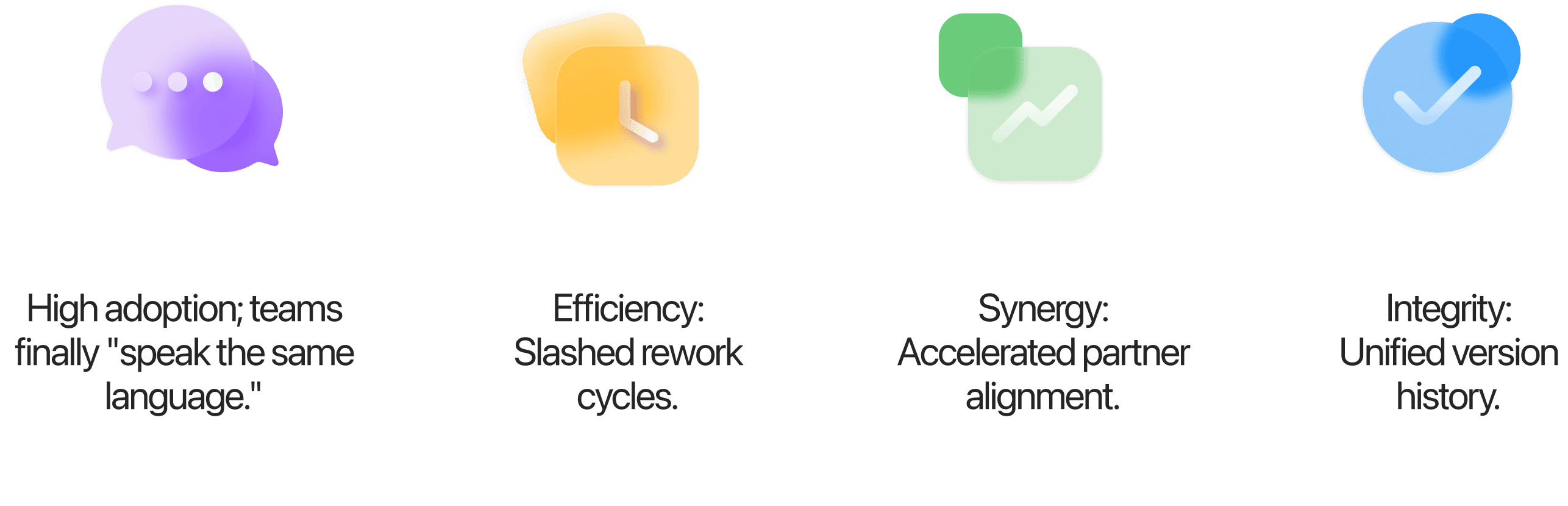
M1 landed well. Teams finally had a shared language. Rework cycles dropped. The 3-week window was reclaimed. And we had the organization's first traceable version history for scenario planning.
Thoughts
“This project proved that complexity is solved by logic, not just layouts.”
The hardest design work here wasn’t the UI — it was understanding the data model deeply enough to make the right structural decisions, and having the conviction to push for pivots when prototype testing revealed the assumptions were wrong.