

Scaling the Agricultural Store Experience
From Sales-Assisted to Self-Service
I led the end-to-end redesign of the FBN Category Experience, transitioning the business from a high-touch, manual sales model to a scalable, self-service e-commerce platform. By architecting a universal component system, I enabled the launch of 6 primary business lines within a 6-month seasonal window.
Executive Summary
Role: Lead Product Designer (End-to-End Category Experience)
Timeline: 6 Months (Fixed seasonal deadline)
Team: 1 PM, 2 Engineers, 1 Marketing Lead, Sales Leadership
Key Impact: +192% surge in store orders; -30% reduction in sales support calls; 6 categories launched on a single, shared codebase.
The Strategic Mandate:
Breaking the "Retail Bottleneck"
My goal wasn't just a UI refresh—it was a strategic overhaul to move the business from a manual, sales-assisted model to a scalable, self-service digital platform where farmers can manage high-stakes purchasing independently.

The legacy UI lacked the fundamental e-commerce patterns—like imagery and pricing transparency—essential for self-service. This created a 'confidence gap' that forced farmers to rely on manual sales support, turning the interface into a major operational bottleneck.

Scope & Constraints:
Designing for the Real World
I owned the redesign of the Category Experience, building on our established branding system while navigating high-stakes real-world boundaries:
Fixed Deadline: A strict 6-month window to launch before the peak planting season.
Technical Boundary: Legacy Search Engine was out of scope—no backend changes permitted. Meaning our navigational architecture and filtering had to do the heavy lifting for product discovery.

Research Triangulation:
Grounding Design in Data
To move past assumptions, I partnered with a PM to lead a 5-week study, triangulating Grower and Sales Rep interviews, Quantitative Surveys, and Sales Performance Reports.

Key Insights & Design Requirements
The Field Office (Mobile-First Utility): Farmers manage operations on the go. The UI had to prioritize scannability and fast cart-building in high-distraction environments.
High-Stakes Decisions (Contextual Data): Precision is everything. Farmers need deep data—like active ingredients and traits—to mitigate risk independently.
Fulfillment Trust (Delivery Promises): Arrival must align with narrow agronomic windows. Transparency regarding delivery timelines was a non-negotiable trust factor.
Diversified Operations (Unified Architecture): Growers often manage both crops and livestock. The system needed a consistent mental model across all categories.
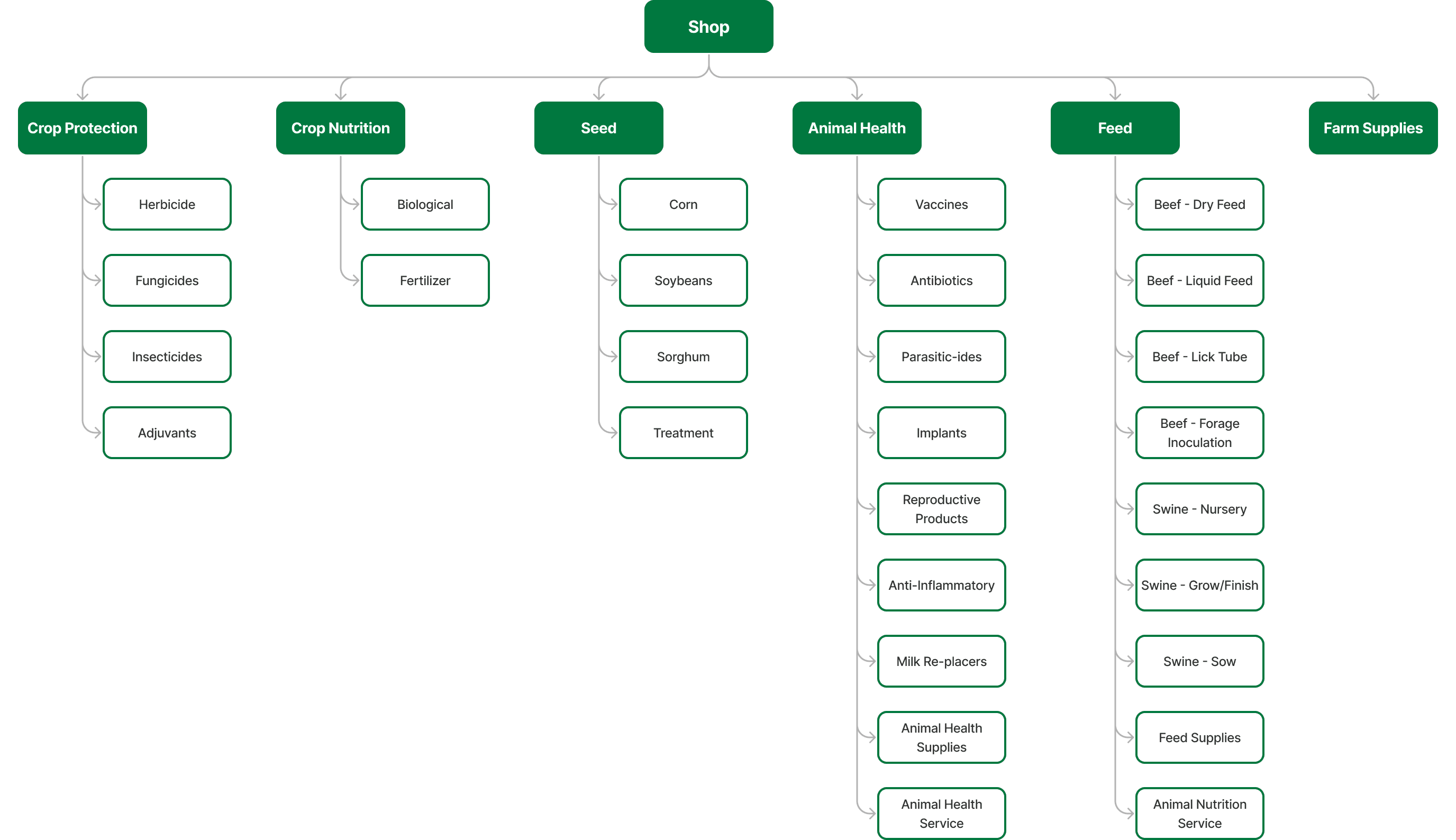
Mapping the Scale –
Complexity vs. Consistency
I mapped the site architecture and aligned with stakeholders to define the specific business lines we needed to support. This audit allowed me to visualize the full volume of the catalog and identify where we could standardize.
The Blueprint –
A Scalable Framework for Every Category
I developed a foundational page architecture to serve as a flexible framework for our Category and Subcategory levels. Rather than a rigid template, this was a modular blueprint that established a consistent mental model while allowing for localized adaptations.
Trust Layer: Delivery promises and fulfillment info anchored at the top.
Discovery Layer: Robust category navigation and chips-based filtering.
Conversion Layer: Universal product cards with tiered contextual data.
Business Layer: Dedicated slots for marketing banners and promotional content.
Rapid Iteration – Component Exploration
With the main page structure established and the core components identified, I moved through multiple rounds of rapid lo-fi iteration.

Execution: The "Decision Engines"
I focused execution on the two highest-leverage components: the Universal Product Card and the Filtering System.
The Universal Product Card (ISD-Level Hierarchy)
A major challenge was the level of abstraction. I led a collaborative audit with category owners and aligned on a unified Item Sort Data (ISD) level hierarchy.
Solution: We grouped complex variations (e.g., package sizes) into a single, clean card.
Impact: This significantly reduced cognitive load, helping farmers find product families without being overwhelmed by SKU-level noise.
Scalability: A "toggle" system allows us to show or hide data points (like prescription icons) without breaking the underlying schema.

Filtering for Speed
Since search update was out of scope, filtering became our discovery engine. We tested "Progressive Disclosure" against "All-Chips-in-Groups."
Winner: All-Chips-in-Groups.
Rationale: Farmers in the field need to scan every attribute simultaneously. The chip pattern provided the transparency and speed required for high-stakes decisions.

Iteration: Balancing Business & User Needs
I maintained a constant feedback loop between stakeholders and users to refine the system.
Stakeholder Alignment: Sales Margin Optimization
Business owners needed to shift the sales mix toward high-margin FBN proprietary products. I integrated an "As Compared To" component into the card schema. This gave farmers the evidence-based transparency needed to trust FBN alternatives, helping them save money while increasing company margins.

User Validation: Vertical Density & Discovery
Testing revealed that our initial mobile cards were too "big," creating a false floor that hindered discovery. I partnered with engineering to analyze catalog data; discovering that only 11% of products had extra-long titles, I pivoted to a high-density grid. By narrowing the cards and allowing the next row to "peek," we significantly increased product discovery.

The Final Design
The final interface delivered a modern, mobile-first category experience


The Impact – Business & User Success
The results were transformative. Six months post-launch, we saw a 192% surge in orders on tableau and a significant decrease in sales support calls.
This validated that by solving for transparency and mobile-first utility, we successfully transitioned the farmer’s procurement journey from a high-touch manual process to a confident, autonomous experience.
